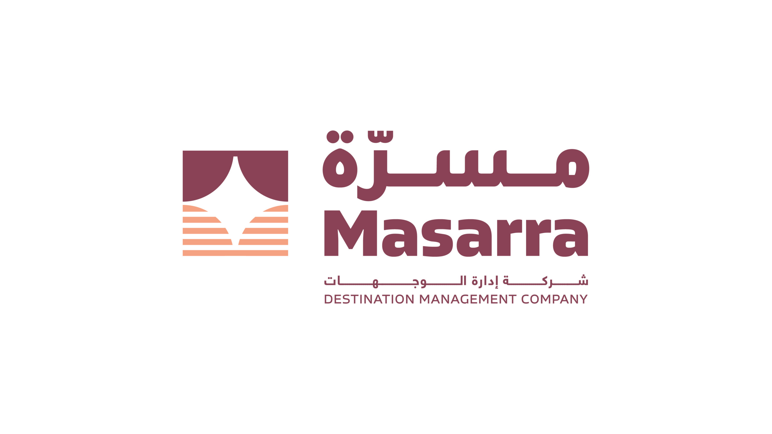
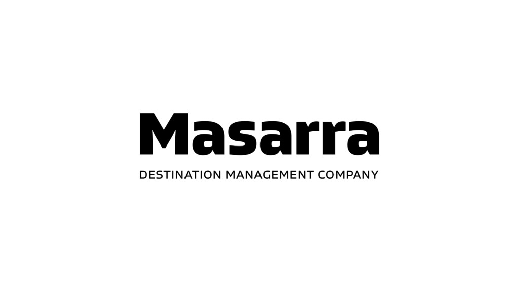
Horizontal Latin Brandmark - Rollover and click to download logo pack
Brand Use
Please ensure these components are downloaded from the approved sources and never recreated in any manner – unless specified otherwise – for example for new graphic illustrations.
Brandmark Versions
The following are the approved brandmarks for use across the entire Masarra brand.
Brandmarks should never be modified and always appear in proportion, following the minimum clear space rules whenever possible.
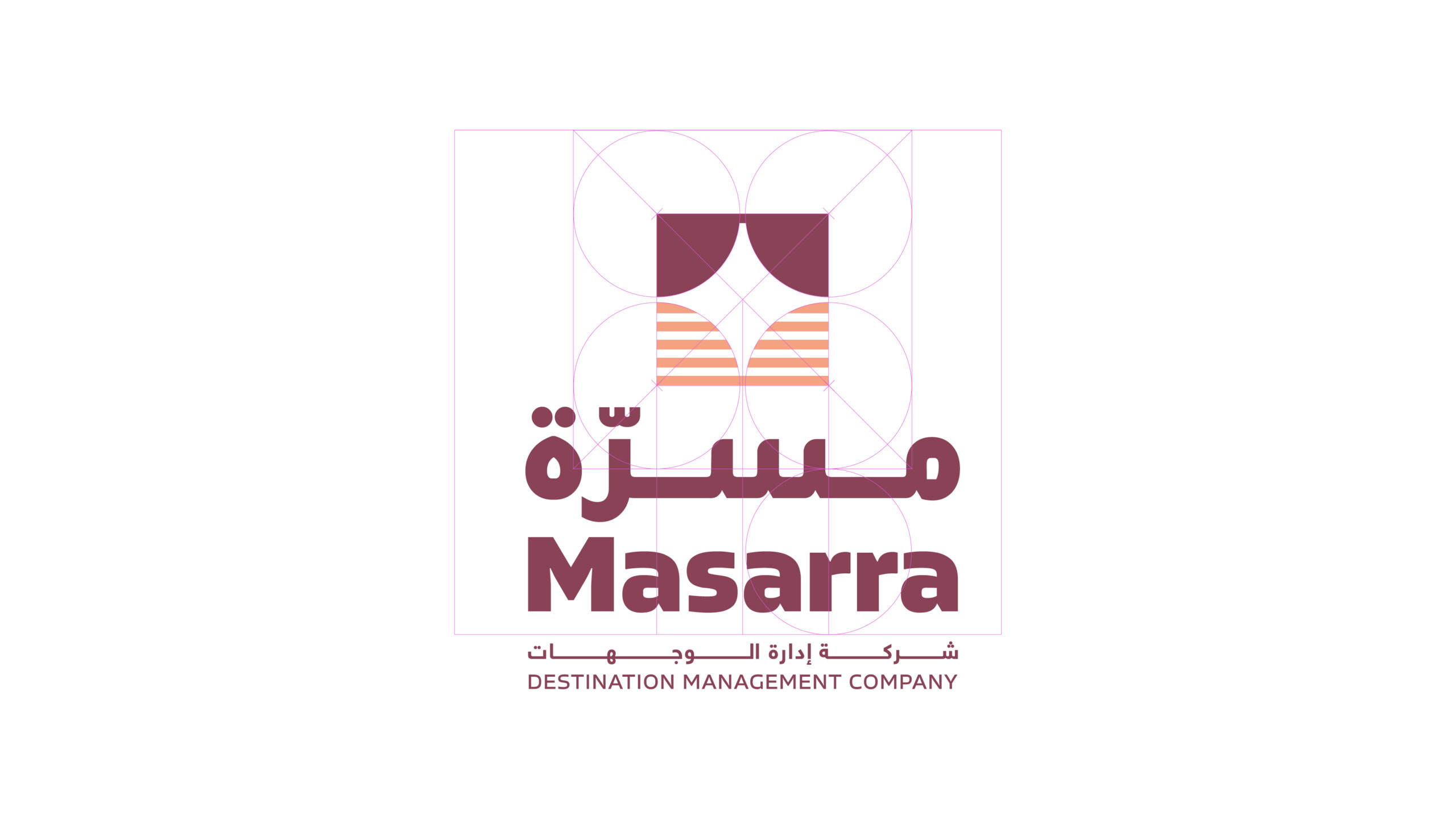
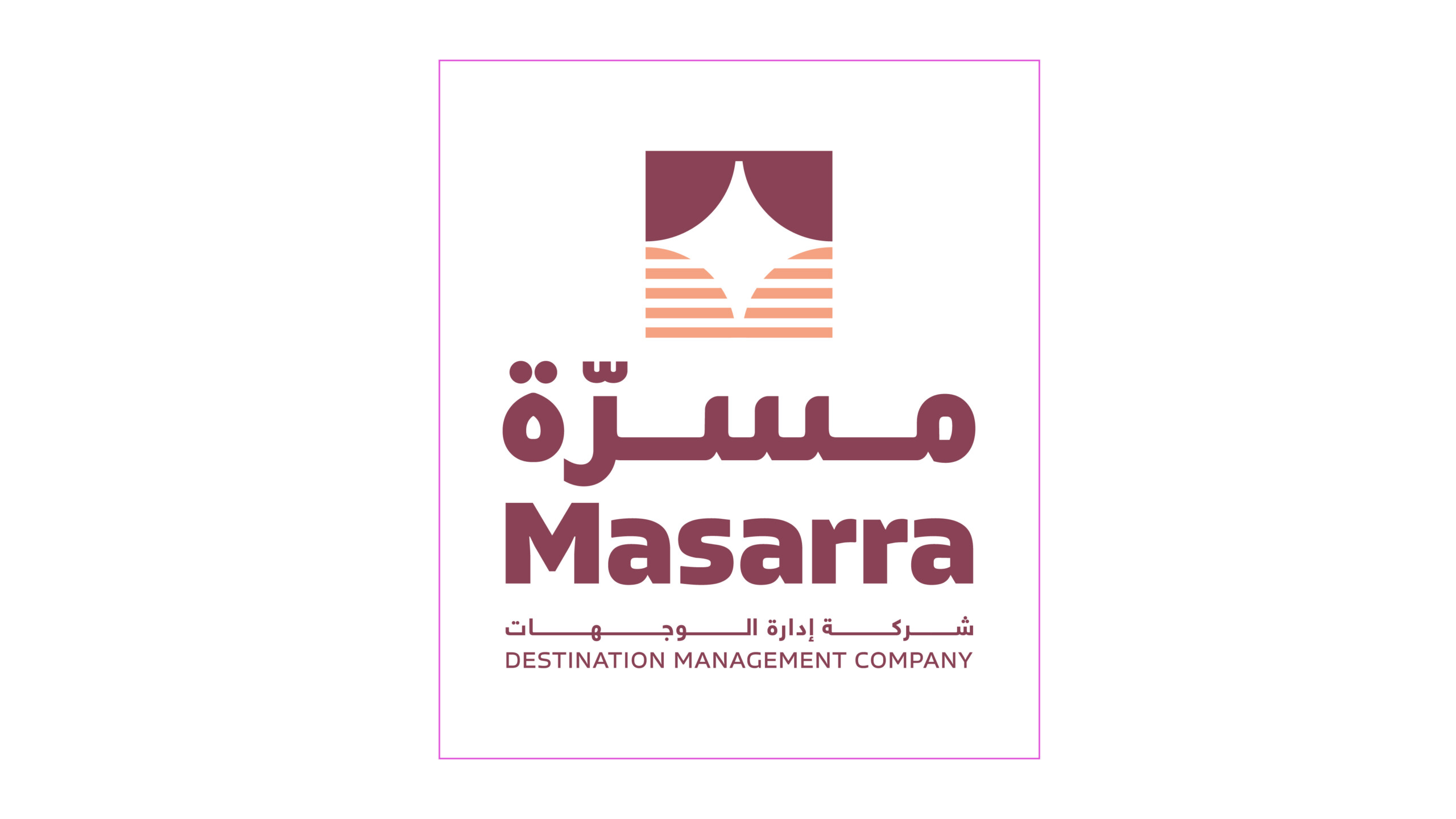
There are two formats of the Masarra brandmark that are available in three variants – English, Arabic and dual language, and a single brand icon that can be used independent of the full brandmark.
In addition to above, the brandmark is available in a number of colour variants as previewed below.
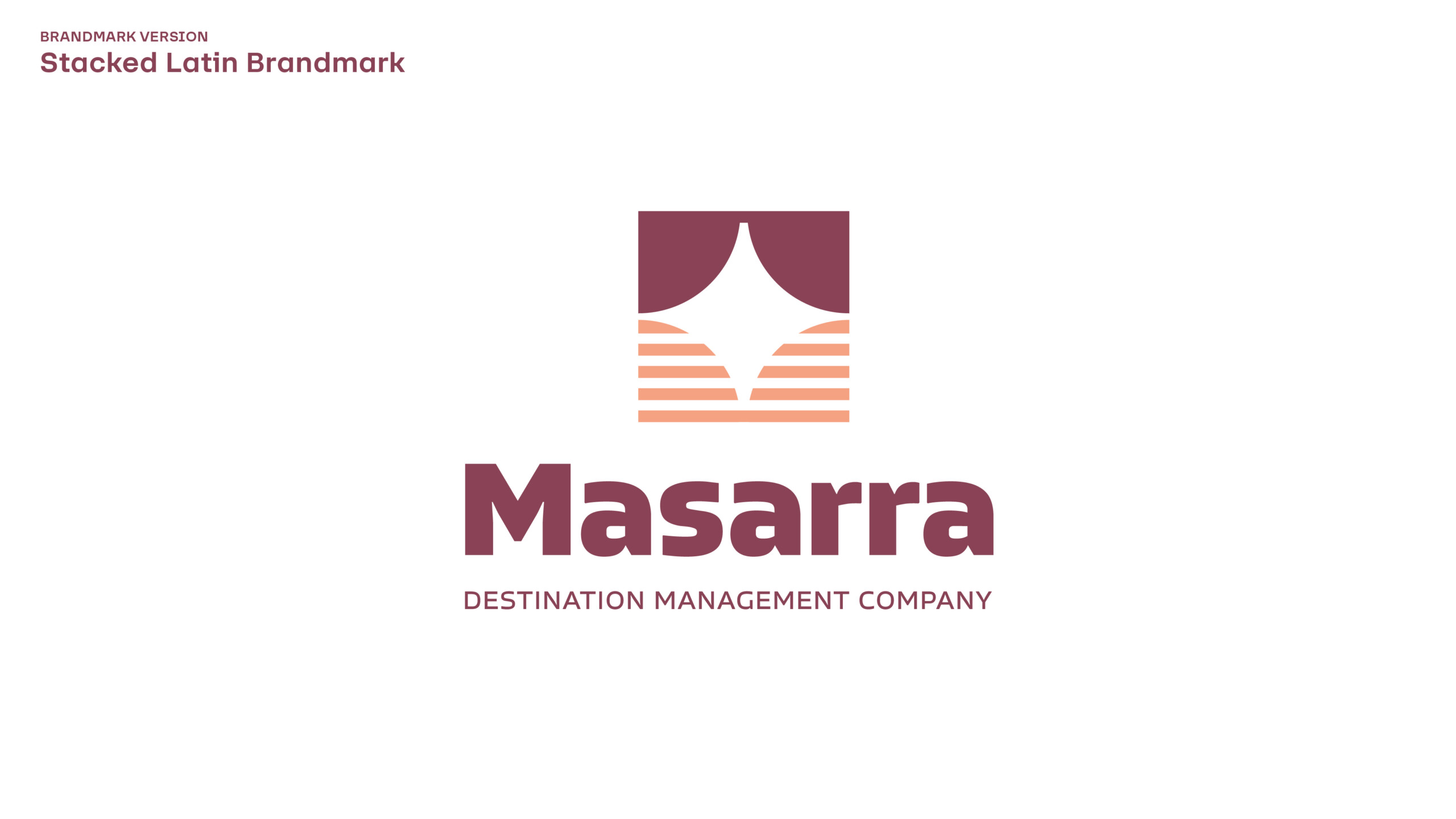
Stacked Latin Brandmark - Rollover and click to download logo pack
Stacked Arabic Brandmark
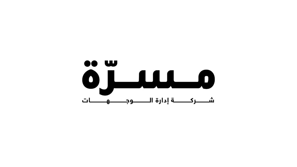
Horizontal Arabic Brandmark
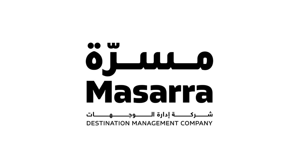
Dual Language Horizontal Brandmark
Dual Language Stacked Brandmark
Colour Versions
The following are the range of colour variants available for Masarra. Please use own judgment on best colour variant to be implemented. It is important to remember that the Masarra brandmark should always be legible and visible clearly across all types of media and applications.
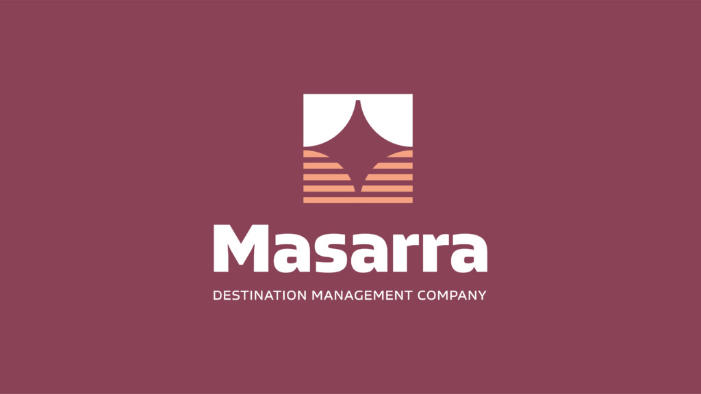
Primary colour variant
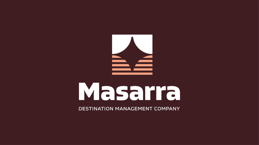
Reverse colour variant on Garnet
Reverse colour variant on Clay
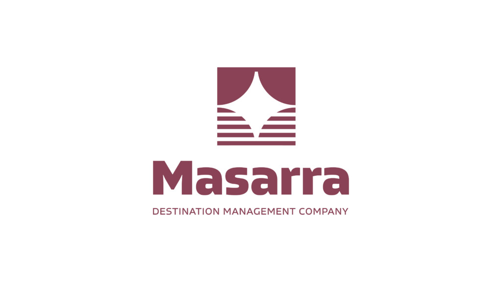
Single colour variant on White
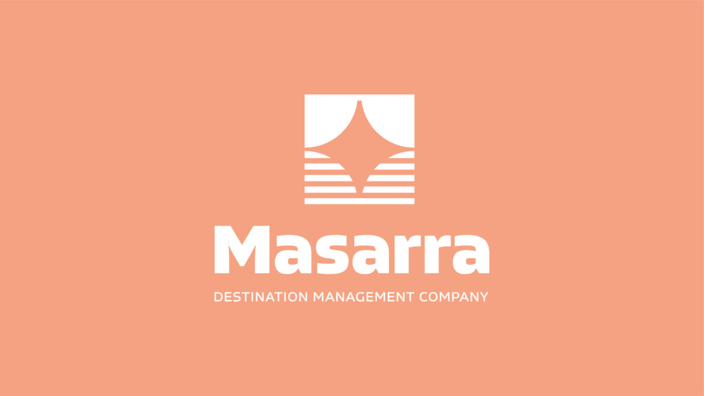
Single colour variant on Shimmer
Single colour variant on Garnet
Single colour variant on Dark
Brand / Fav Icon
The Leap icon can be used independent of the full brandmark across all applications. This can be implemented over time as brand recognition increases. The Leap icon should NEVER be modified in any manner.
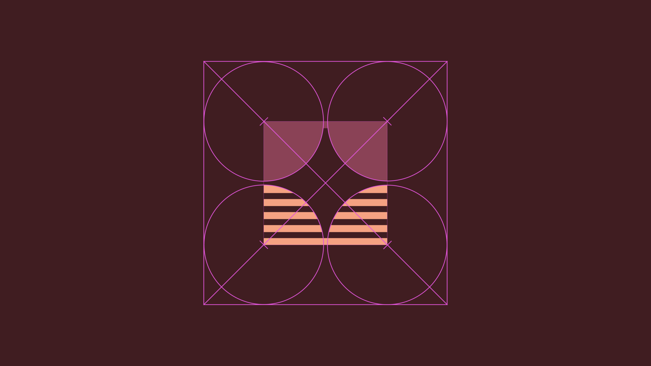
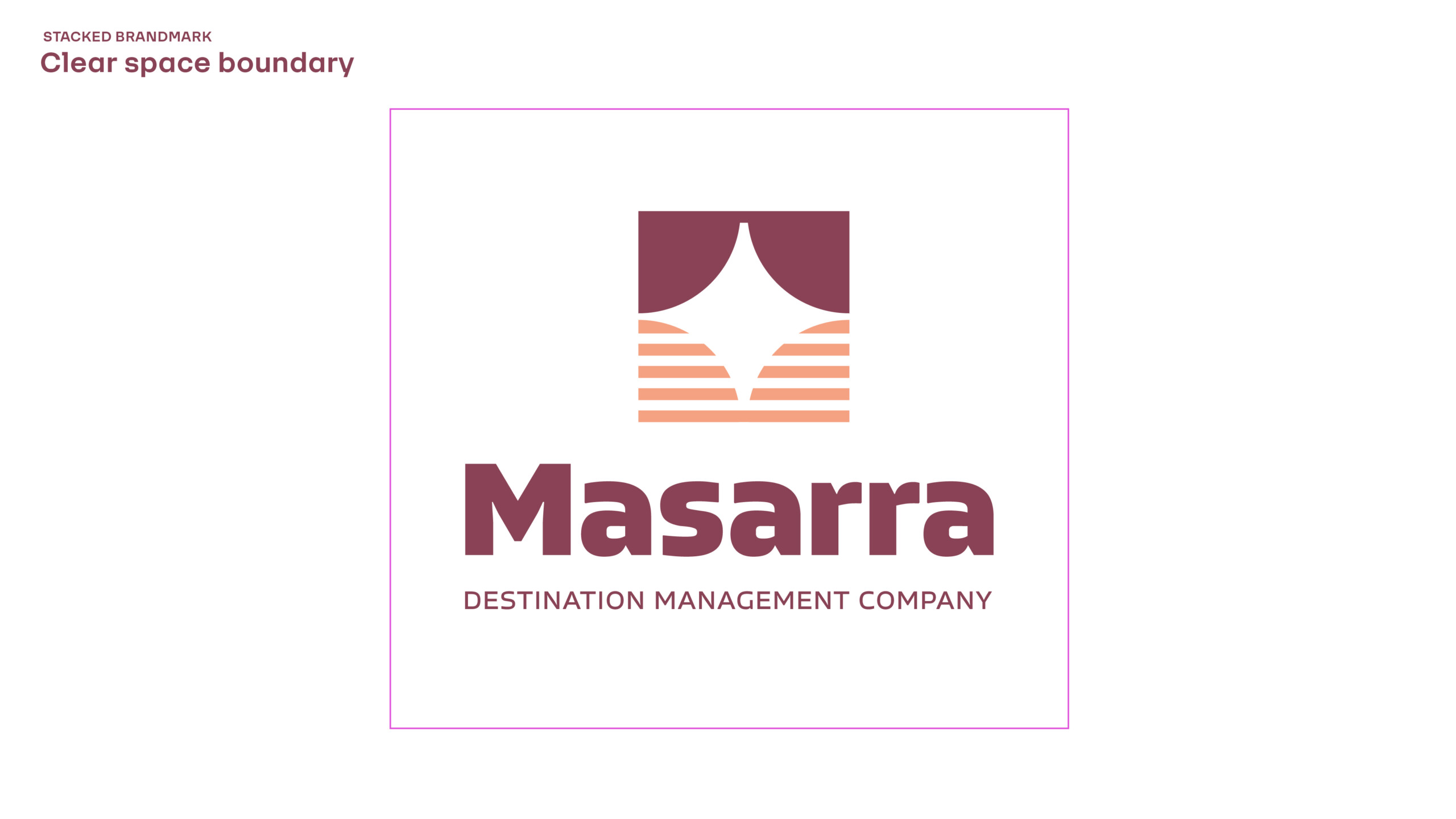
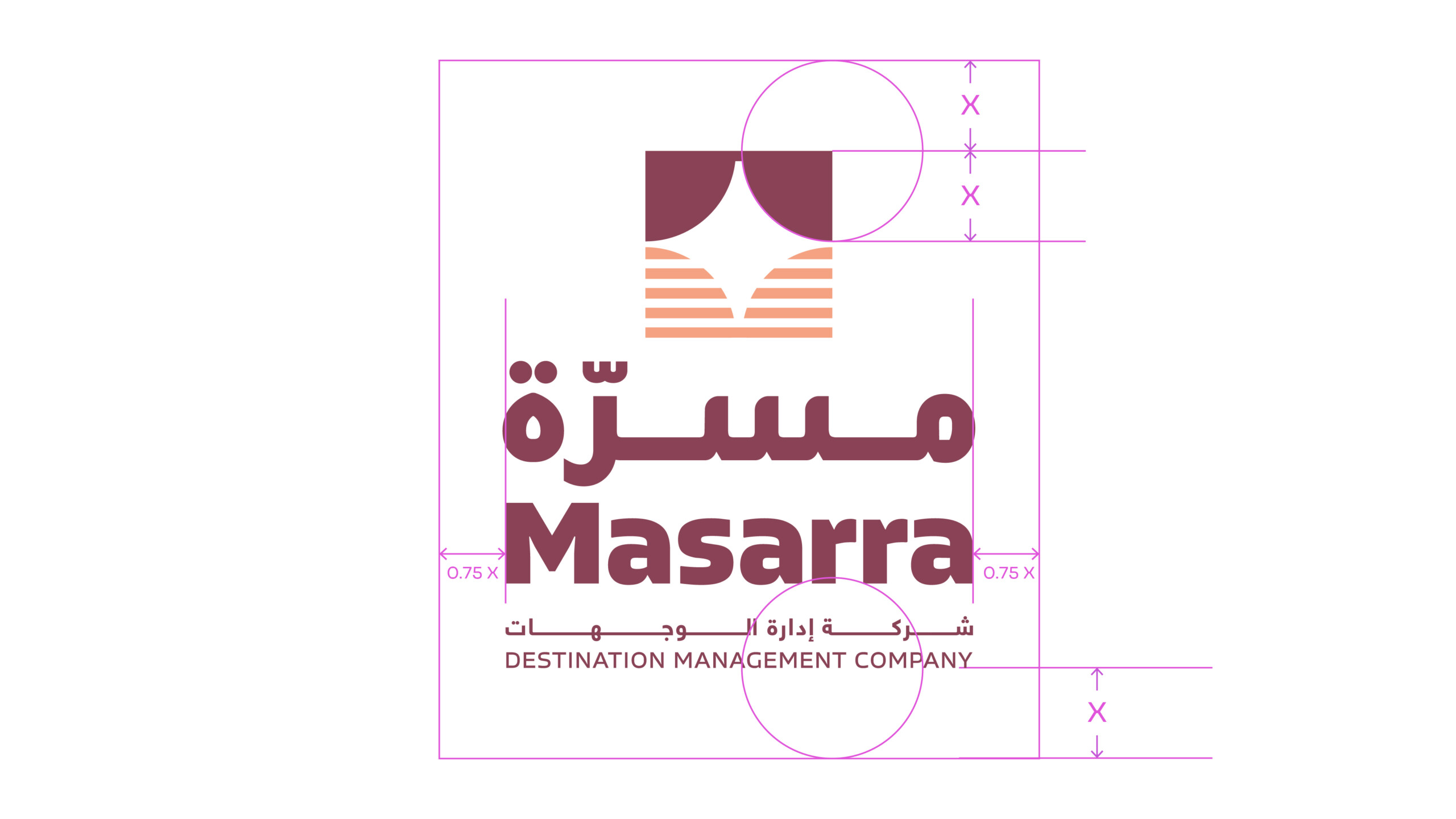
Clear Space
Minimum space rules varies slightly for the brand icon – with the right hand side of the icon requiring less clear space. This ensures the icon is visually balanced within a crop.
The clear space rules can be disregarded when using in digital applications and it is being featured as fav icon or profile image.
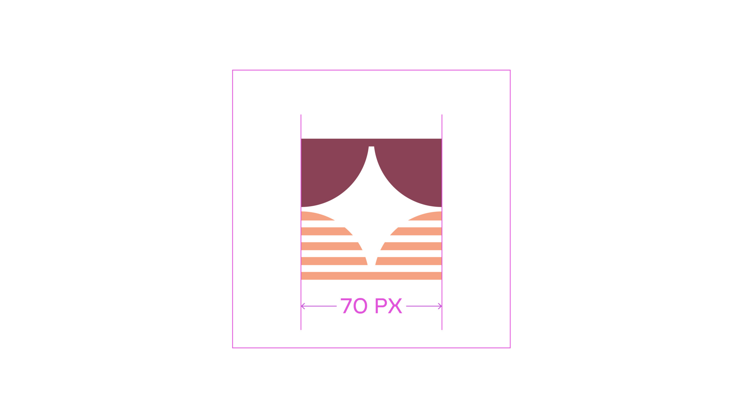
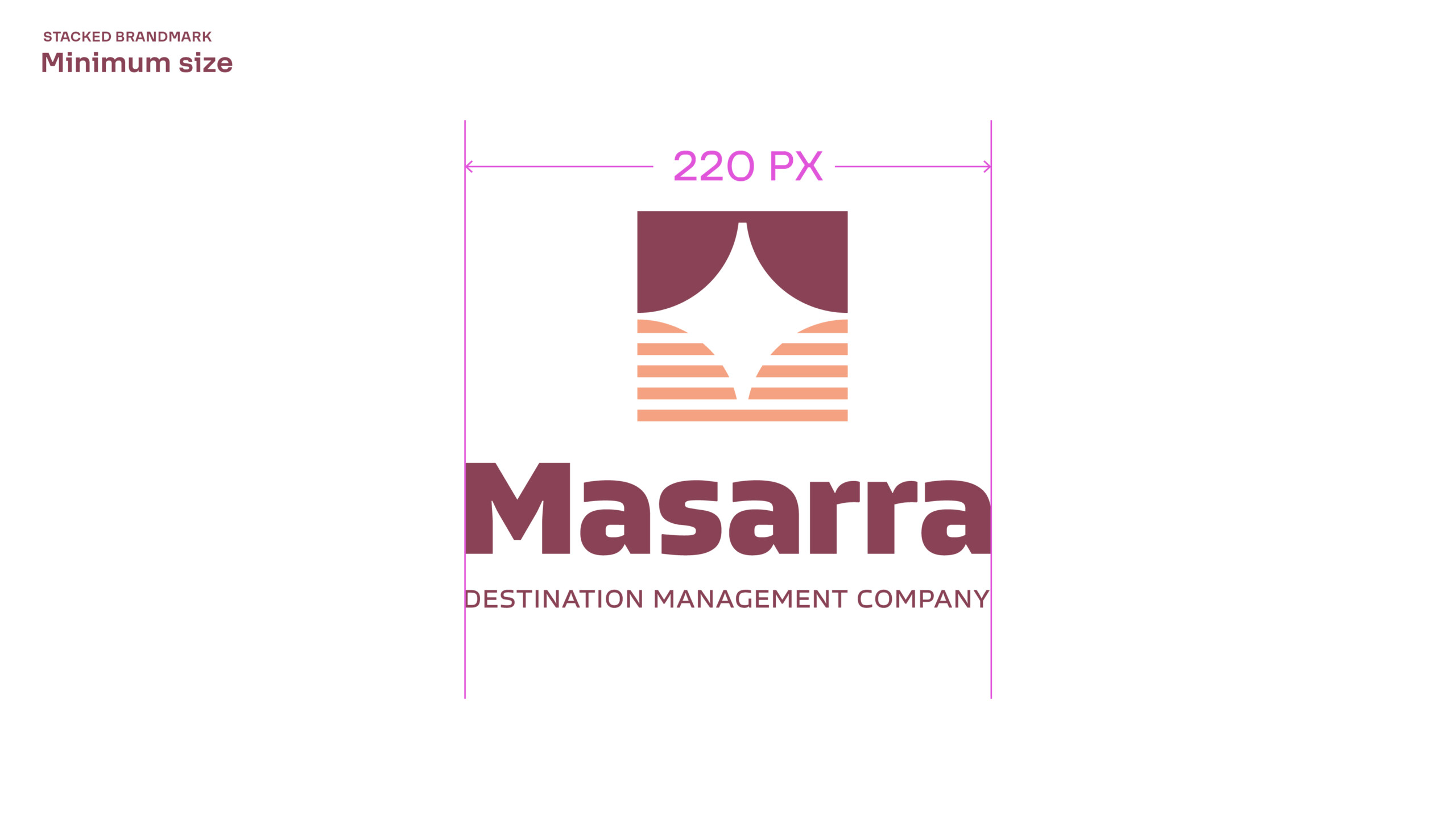
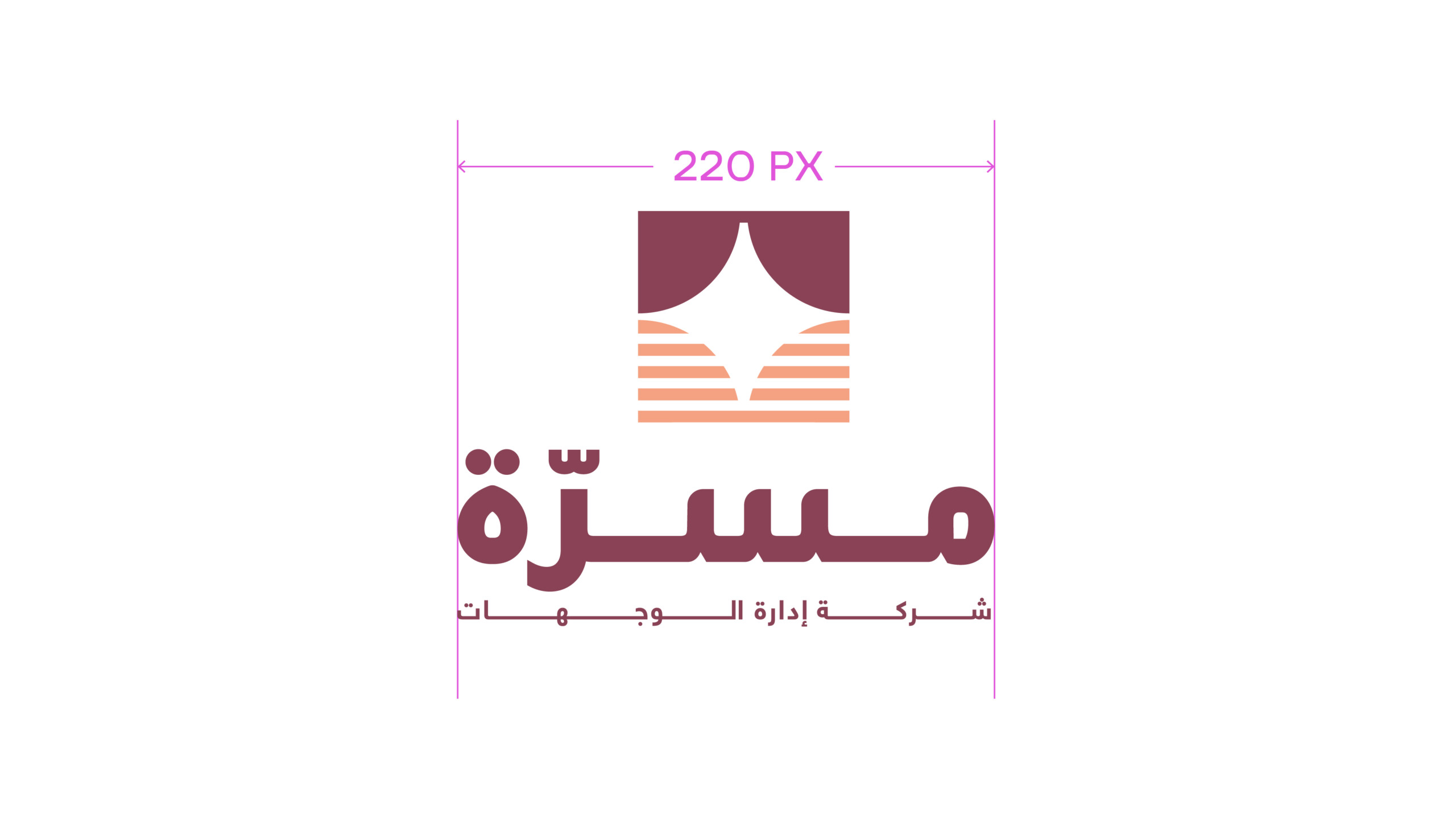
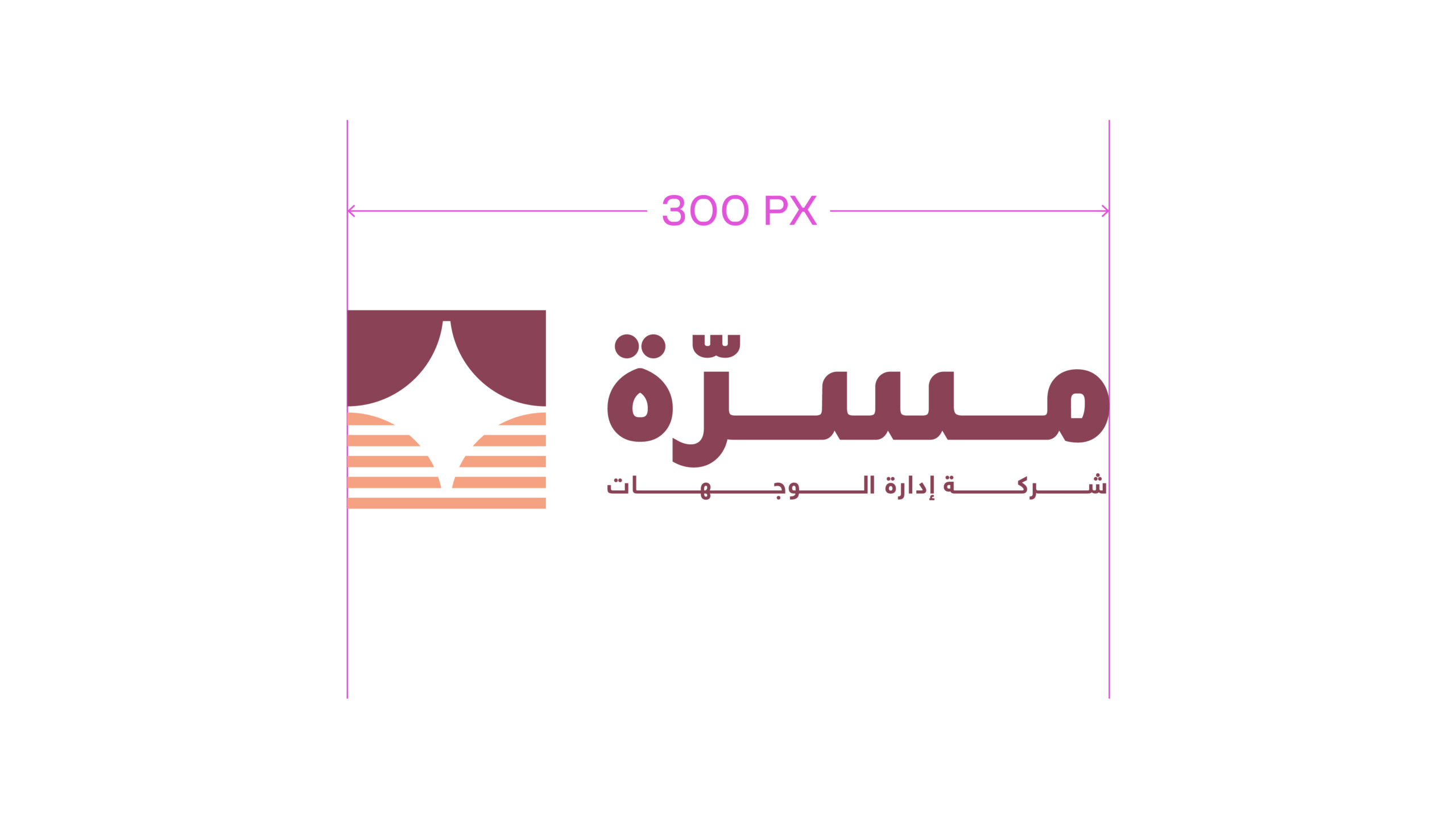
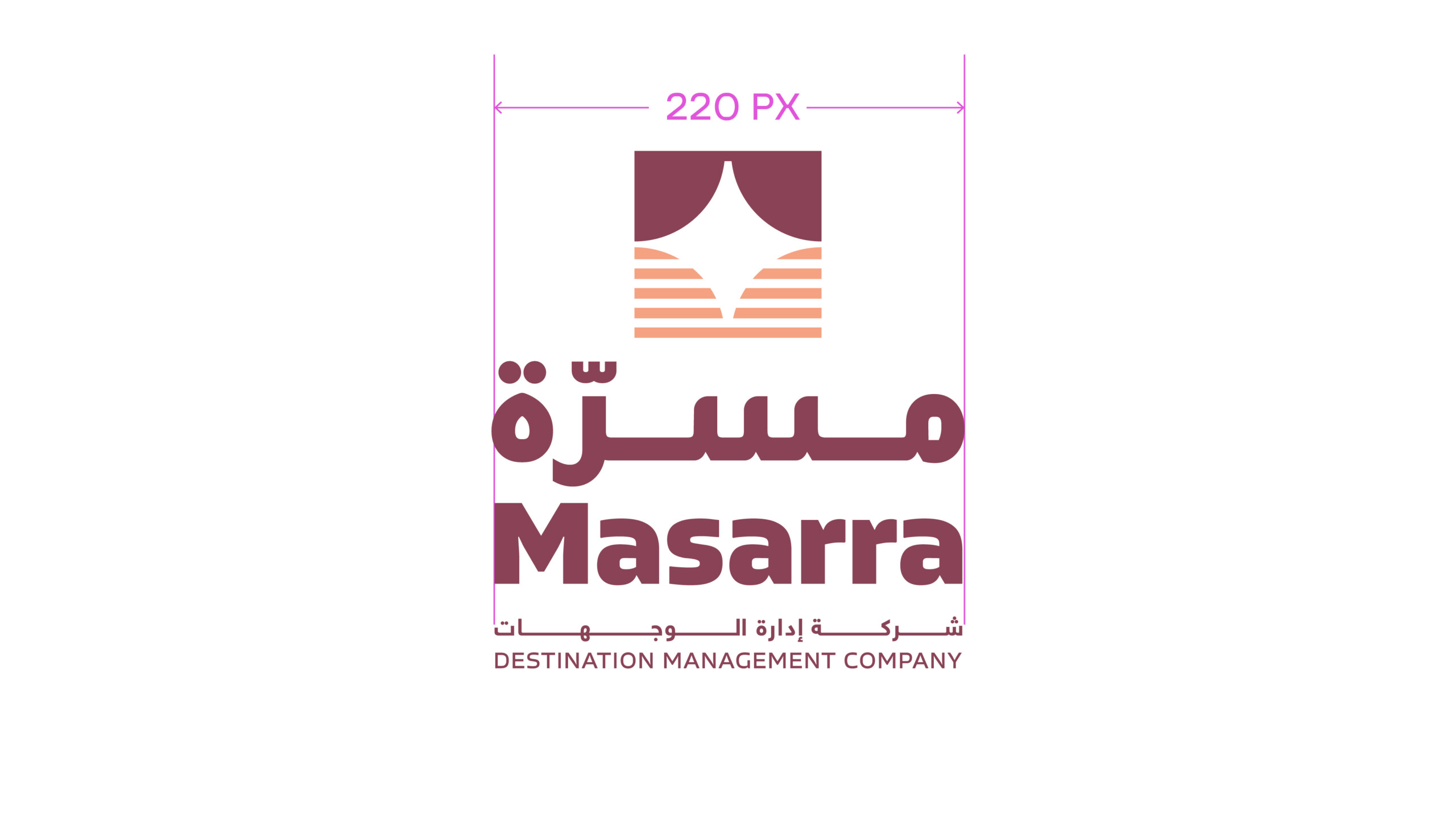
Minimum Size
The minimum width for the icon is set at 30px on a 227dpi size screen and should never be featured at a smaller size. This ensures the legibility of the brand icon is always maintained.
Usage
The brand icon should be avoided being over used, and not feature in the same substrate or screen wherever the full brandmark is featured.
In digital applications, both brandmark and brand symbol use should be avoided whenever possible – unless it is a function of a particular application. For example the icon featuring in the browser bar, with the full brandmark featured on the website.

Wordmark
The Masarra word mark can be used independent of the Masarra brand icon. This should only be implemented sparingly in special-use applications OR space restrictive applications only.
Some example of use-cases maybe a specific component of brand stationery such as the word mark on a Pencil, or a component element of a VVIP application.
Special Use Brandmark - Small size use only
The following Arabic variant of the brandmark should ONLY be used IF and when required from a legal or administration perspective and NEVER internationally.
The Arabic brandmark can also be considered for use in exceptional circumstances on dedicated VVIP arabic only communication – such as an invite to special event.
However whenever possible the Latin brandmark should always be the default brandmark of choice to use.
Special use brandmark
Secondary Arabic Brandmark
Usage Rules
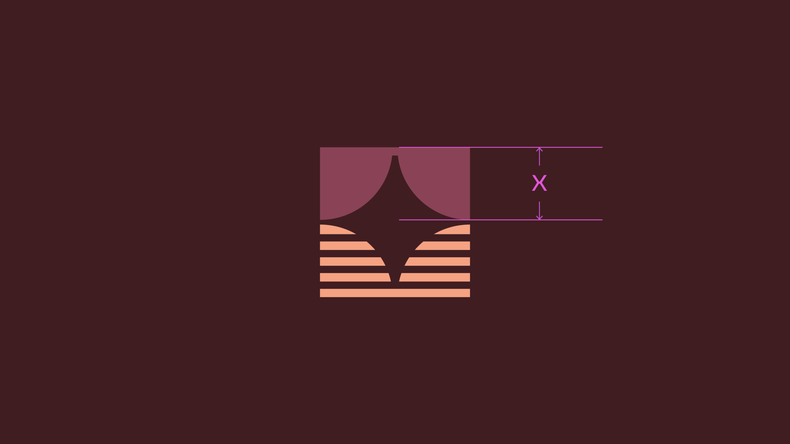
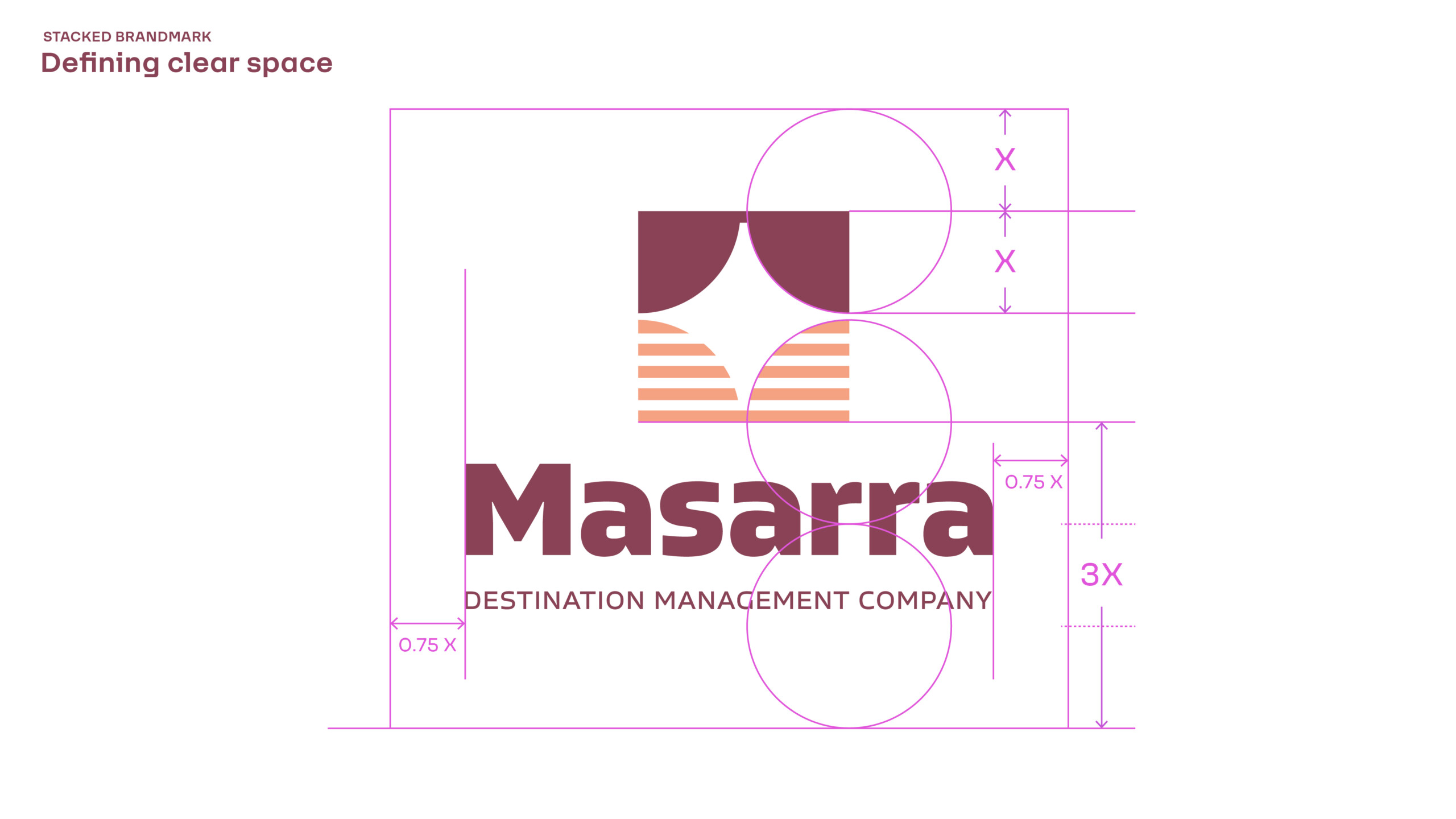
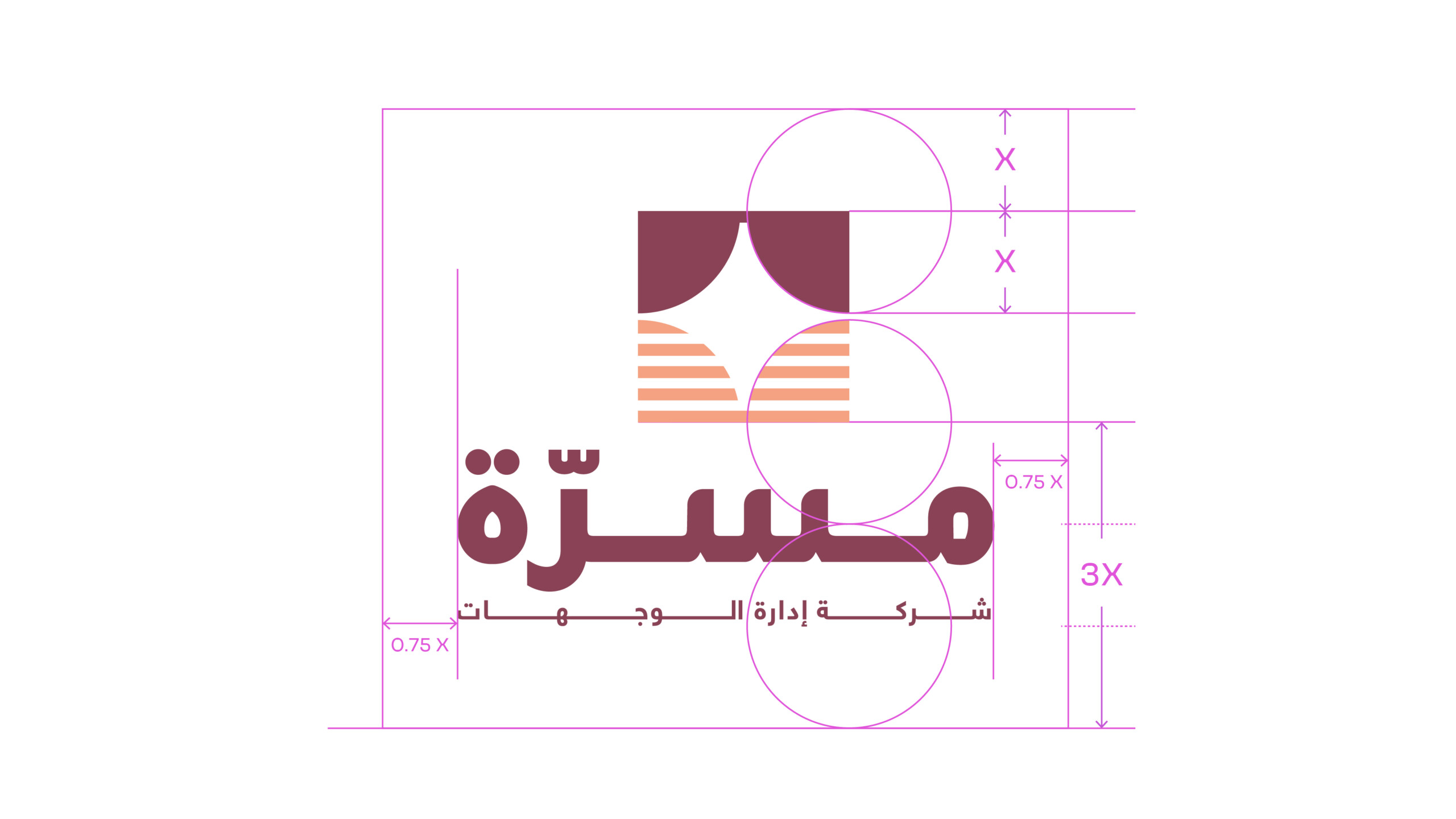
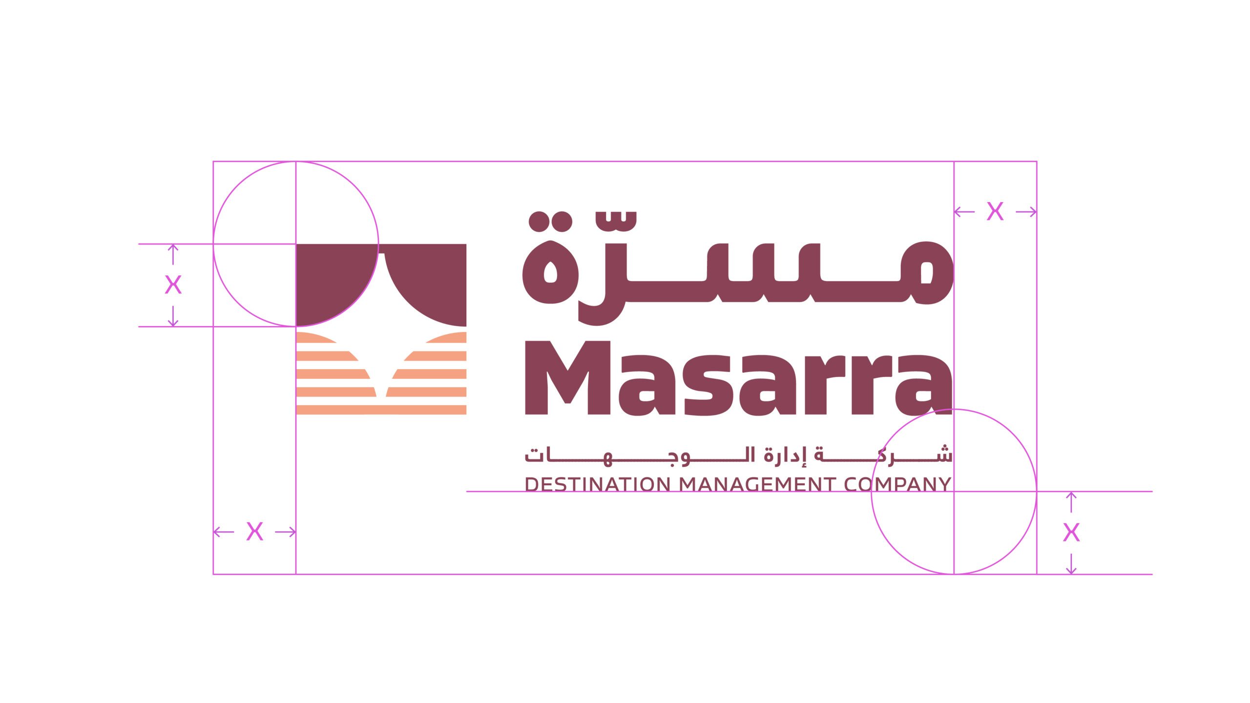
Clear Space
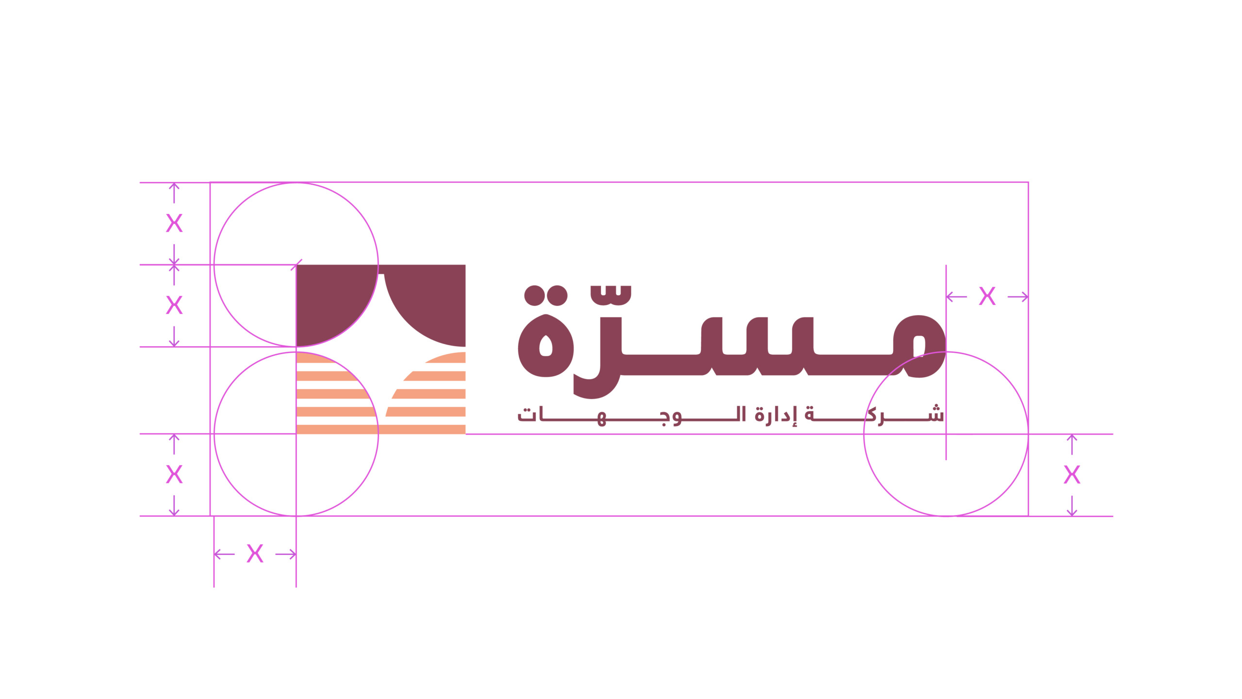
Clear space is equal to the x-height of the LEAP wordmark and should be adhered to strictly whenever possible. The following is breakdown of the clear space required around each brandmark variant.
Defining Clear Space
1. The x-height of the brandmark is used to determine the clear space.
2. The clear space at top and bottom of the brandmark is equal to a x1 x-height.
3. The clear space at left and right of the brandmark is equal to a x2 x-height.
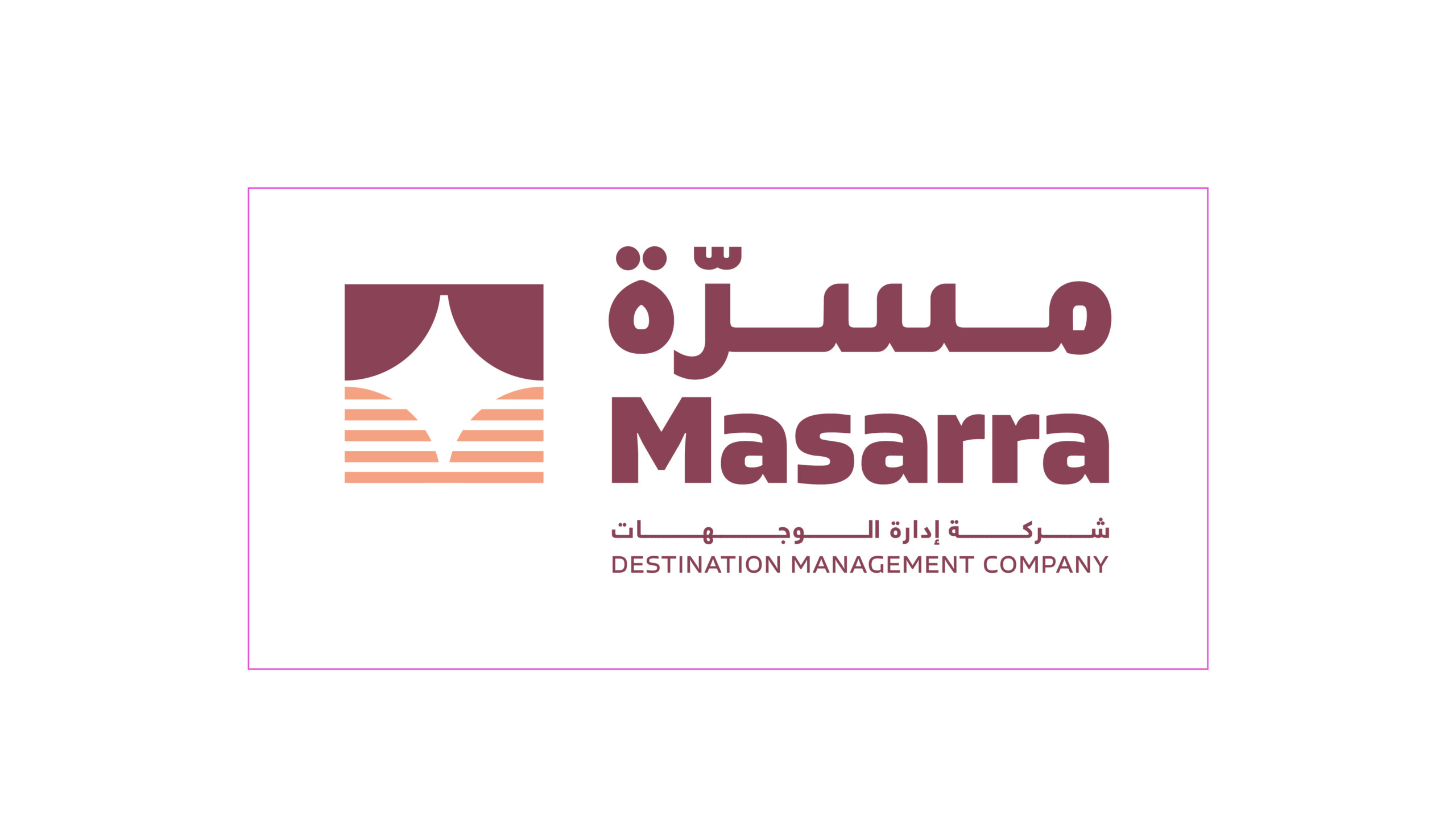
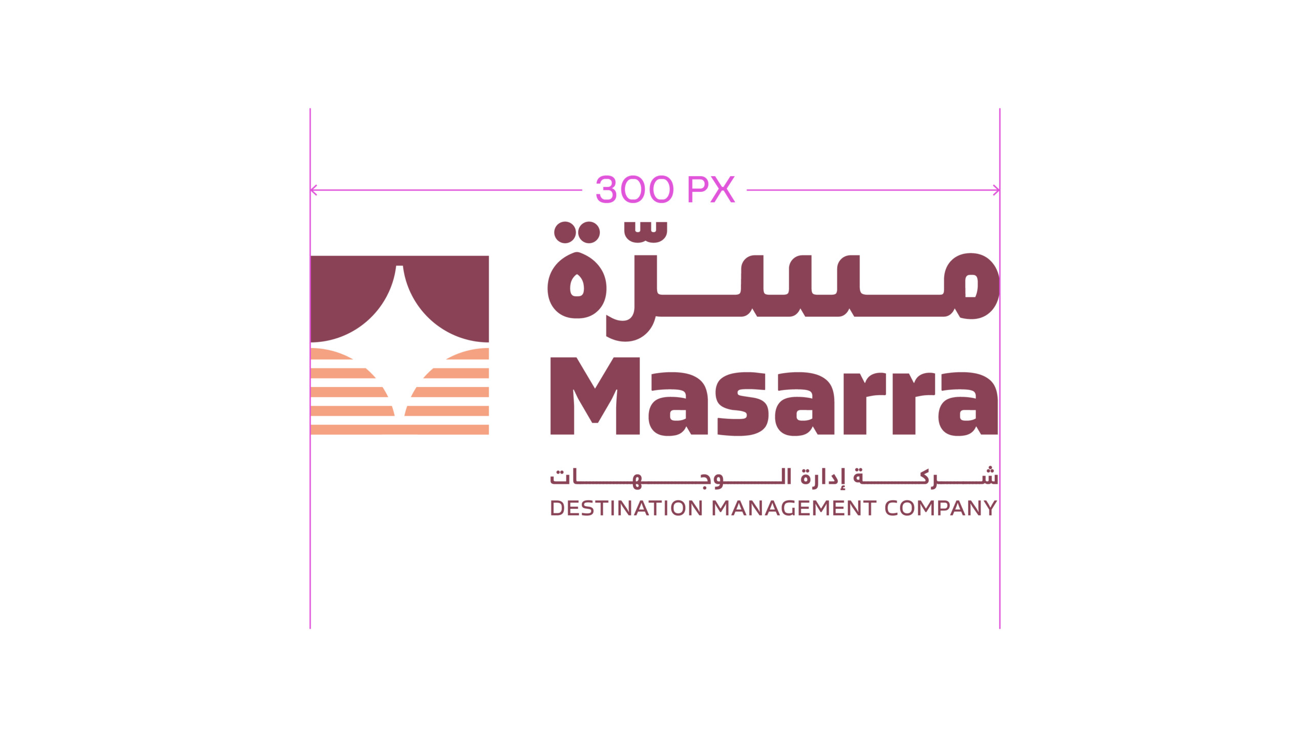
Minimum Size
The minimum size rules should be adhered to strictly. This will ensure the Leap brandmark is always legible across all applications. Visuals not shown to scale.
Colour Versions
There are two colour variants of the brandmark.
The primary brandmark should always be implemented in the full black colour variant. This should be used across all physical and real world applications such as printed collateral, signage, and architectural applications.
Â
Usage: Latin Brandmark
Usage: Arabic Brandmark

Usage: Dual Language Brandmark
Masarra Wordmark
Latin Wordmark
Arabic Wordmark
Dual language Wordmark
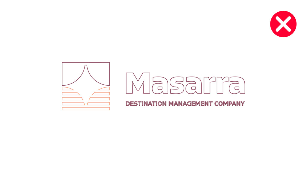
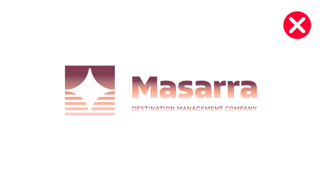
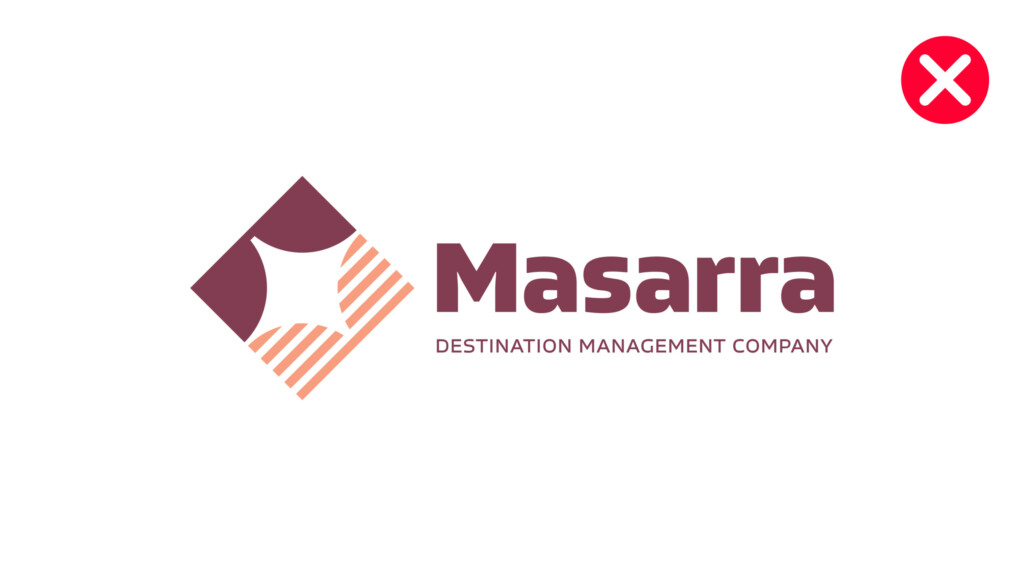
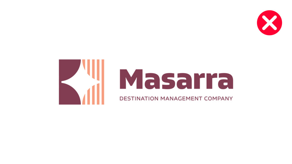
Brandmark Don'ts
Below are a few examples of what not to do with the brandmark. Always ensure brand marks are taken from the approved artwork file, and never adapt the brandmark in any manner with the exception of resizing the brandmark always with the proportions locked.
Do not outline the brandmark
Do not implement the brandmark at an angle
Do not add visual elements
Do not re-arrange the brand icon
Do not add shadows or effects to the brandmark
Do not condense, expand or distort the brandmark in any manner, nor resize out of proportion
Do not alter the wordmark orientation, size or relationship with the brand icon
Do not recolour the brandmark in any manner
Do not skew the brandmark
Do not alter the colouring of the brandmark
Do not alter the colouring of the brandmark
Do not use single colour brand marks other than the approved variants
Do not create new typography for the Masarra wordmark
Do not apply graduated tones to the brandmark
Do not rotate the orientation of the brand icon
Do not rotate the orientation of the brand icon
Colour Palette
The following is the brand colour palette for Masarra and a guide to the ratio of colours that can be used across all brand applications. The ratios should be followed closely amongst the entirety of an individual application. Judgement should be used when additional impact or differentiation is required within an individual screen or section of a communication.
Rollover and click to download Adobe Illustrator Swatch File.
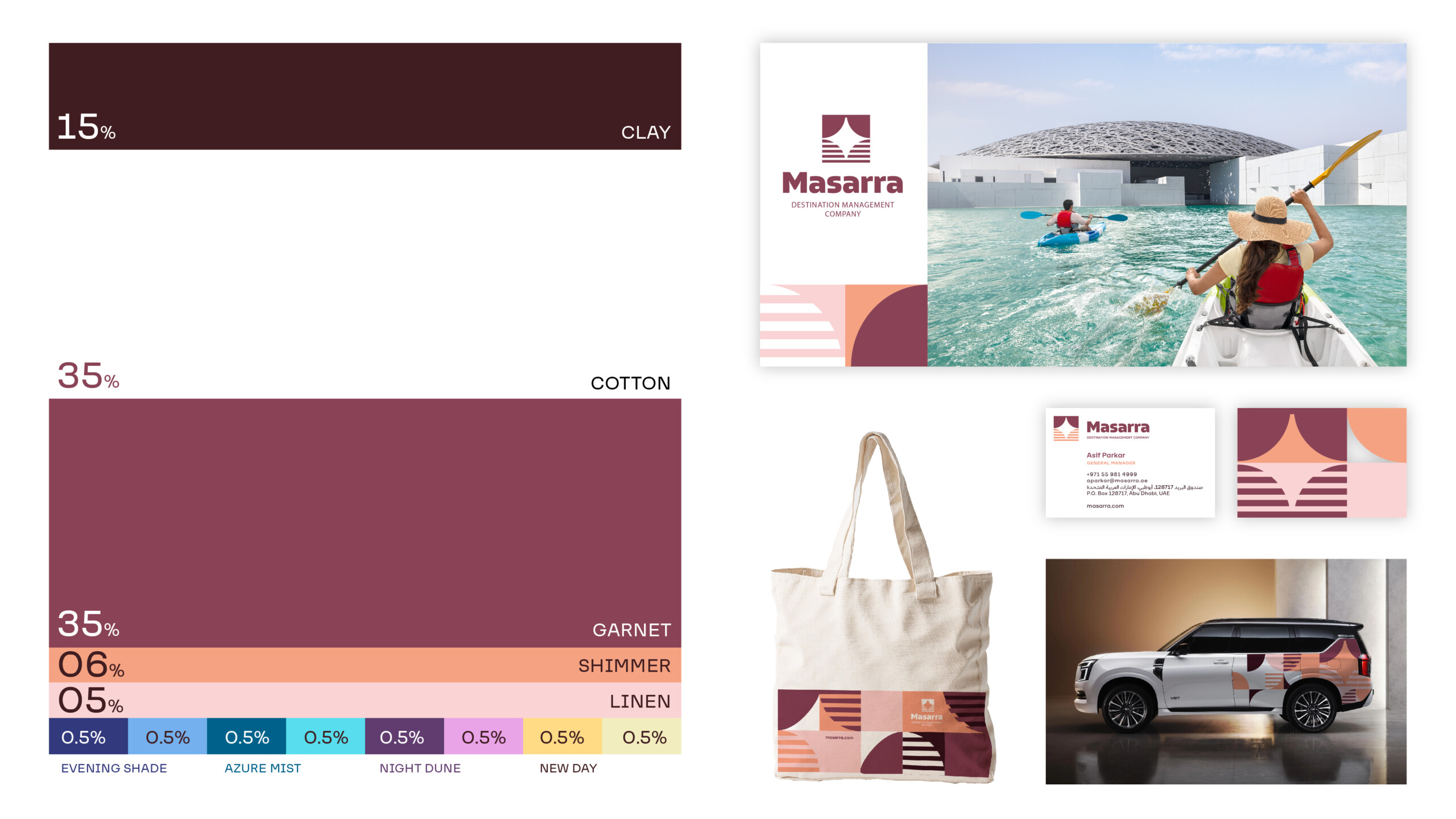
Primary Palette
Clay
#331a21
C 54. M 84. Y 74. K 70
4975 C
Garnet
#804053
C 10. M 70. Y 25. K 50.
7642 C
Shimmer
#fc9e7e
C 00. M 46. Y 48. K 00.
FC9E7E
Linen
#f5ccc7
C 00. M 23. Y 12. K 00.
691 C
Cotton
#ffffff
C 00. M 00. Y 00. K 00
N/A
Tertiary Palette
Evening Shade Dark
#373c7a
TBC
7687 C
Evening Shade Light
#88b0eb
TBC
278 C
Azure Mist Dark
#006289
TBC
633 C
Azure Mist Light
#8edded
TBC
304 C
Night Dune Dark
#583e6d
TBC
7665 C
Night Dune Light
#d8a3e6
TBC
2562 C
New Day Dark
#fbdb8a
TBC
1205 C
New Day Light
#f0edc0
TBC
7499 C
Typography
These are some examples of how the brand typography can be utilised within communications.
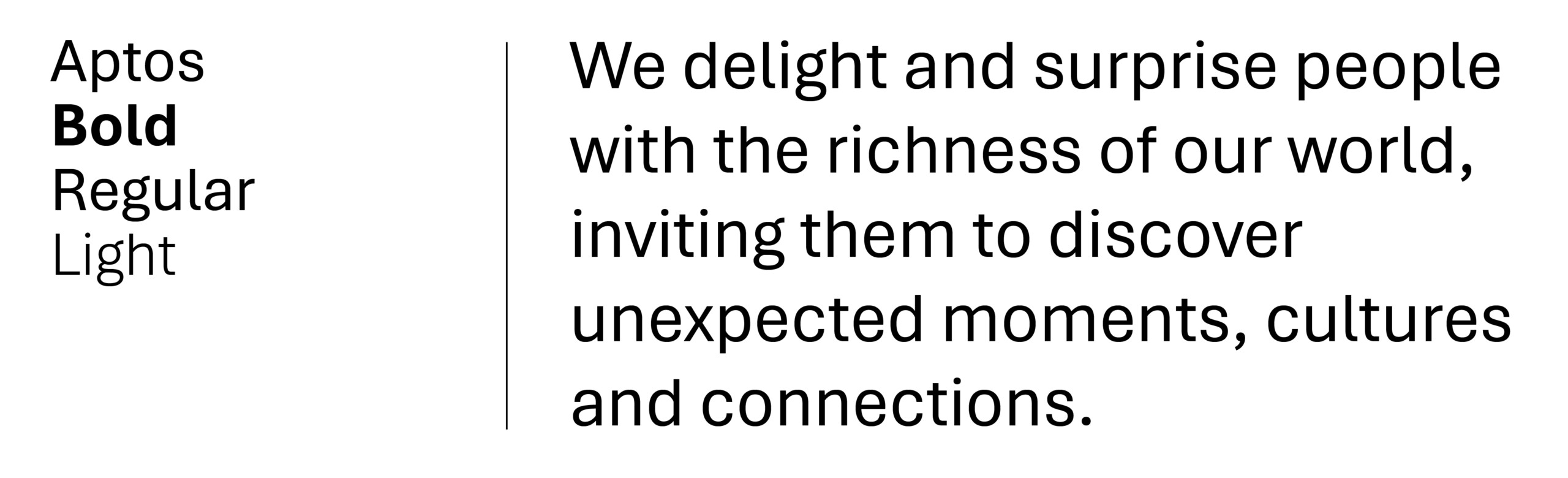
Typography should always be implemented in a clean and structured manner. Particular attention should be given to the weights used for body copy and headlines. Both Lufga and Araboto are available in multiple weights, and dependant on the use case – additional weights can be used if deemed necessary to create a greater hierarchy of information – for example in information graphics or illustrating abstract or complex business concepts.
However as a general rule, the following weights should be primarily used. Note that digital and print use different weights. This ensures better clarity and better alignment of how fonts are viewed on screen vs printed on physical medium.
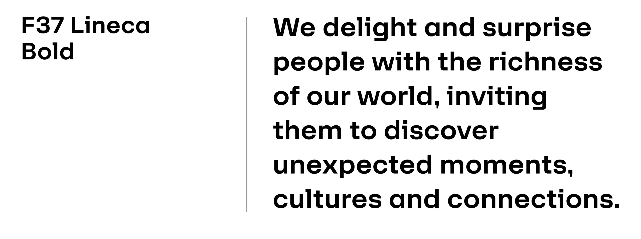
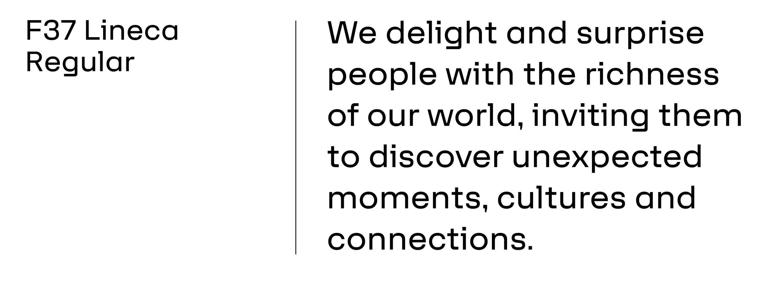
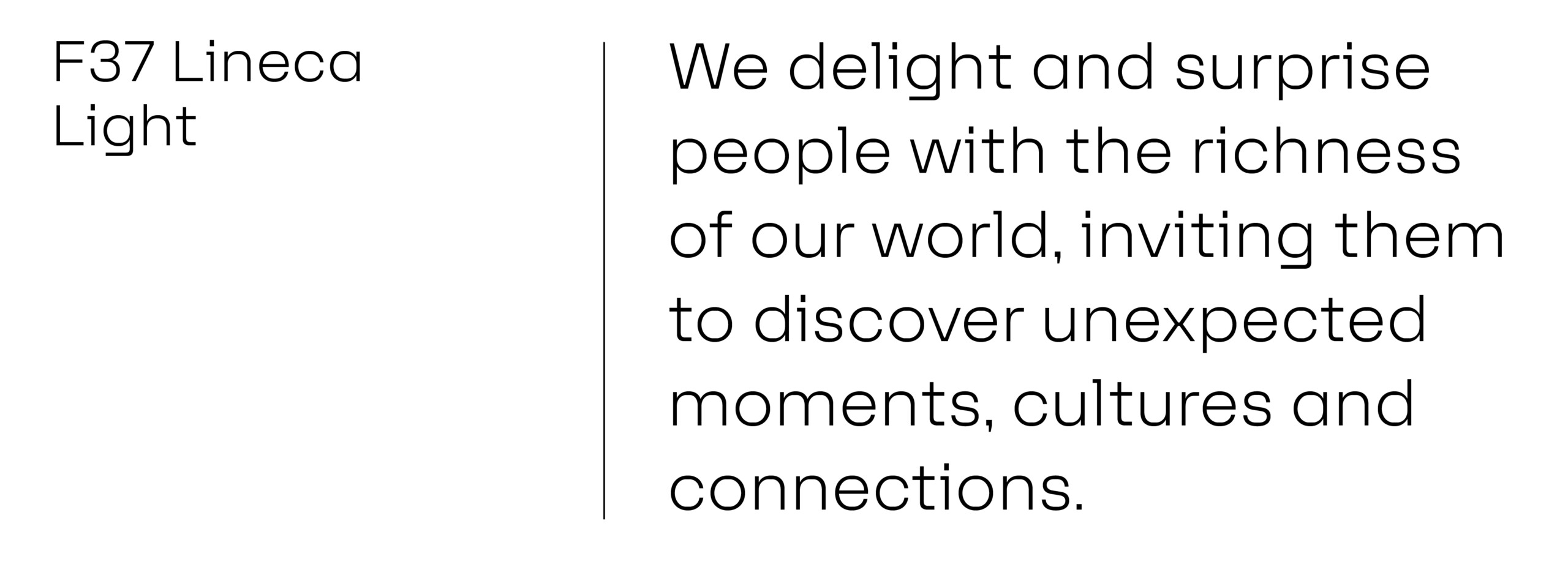
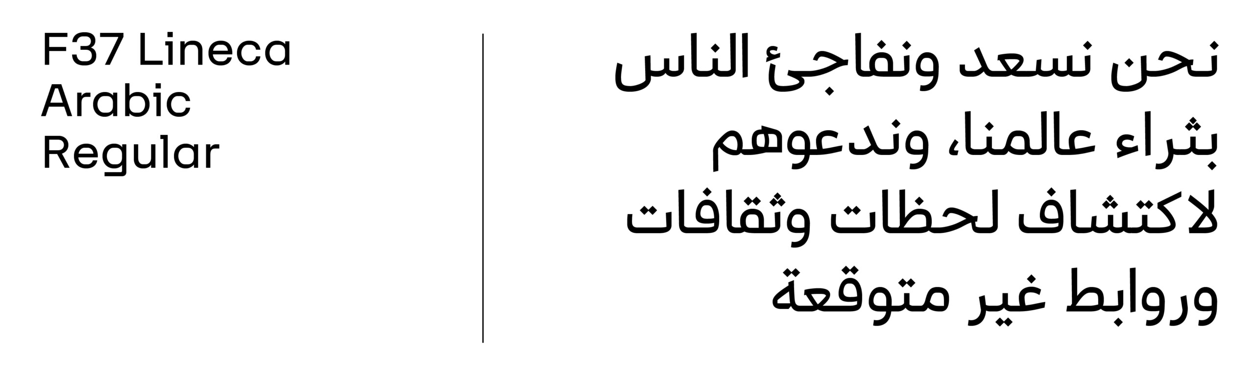
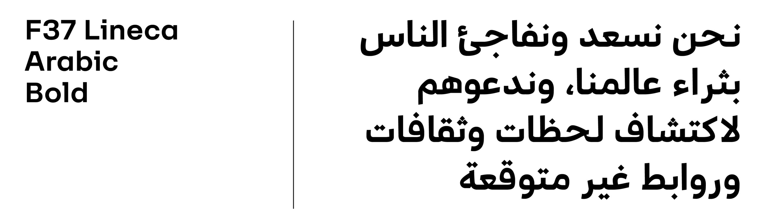
Latin Typeface: F37 Lineca
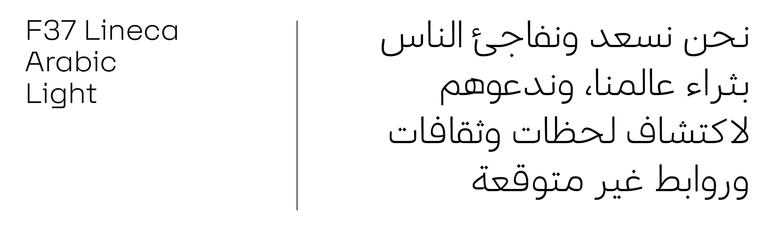
Arabic Typeface: F37 Lineca Arabic
Websafe Type
Typography Rules
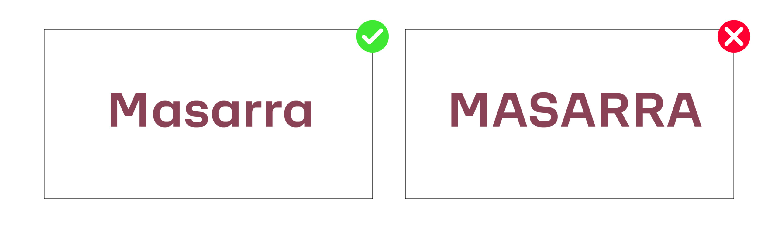
Typing Masarra
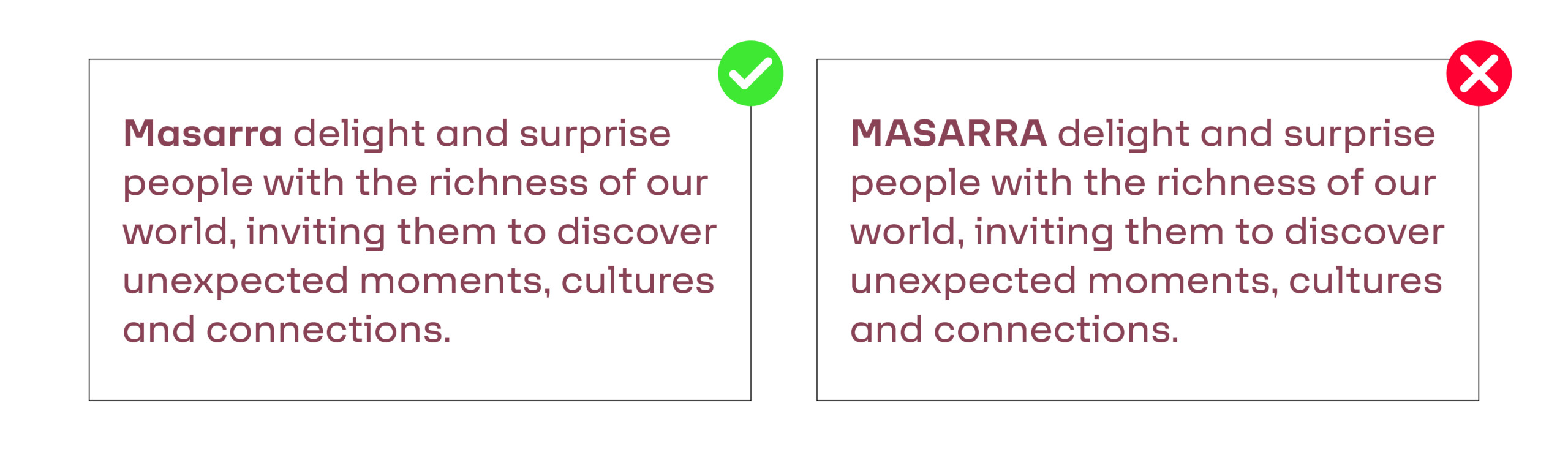
It is important to remember that always type Masarra in sentence case (Uppercase ‘M’, lowercase ‘asarra’), across all applications to create consistency across all mediums and platforms. The primary reasons for this is:
1. Sentence case is easier to read overall.
2. Maintaining consistency between brandmark word mark and how Masarra is written in body copy and headlines.
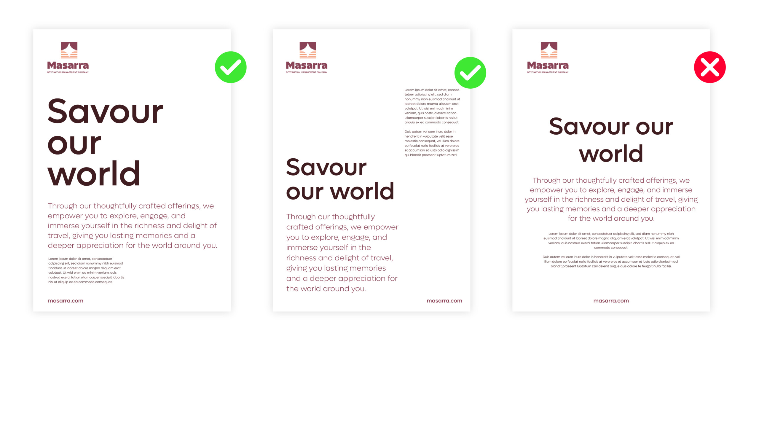
Typography Alignment
We recommend typography is always aligned left whenever feasible. This ensures a consistent look throughout all applications and adopting an inherent design integrity across layouts for both digital and print.
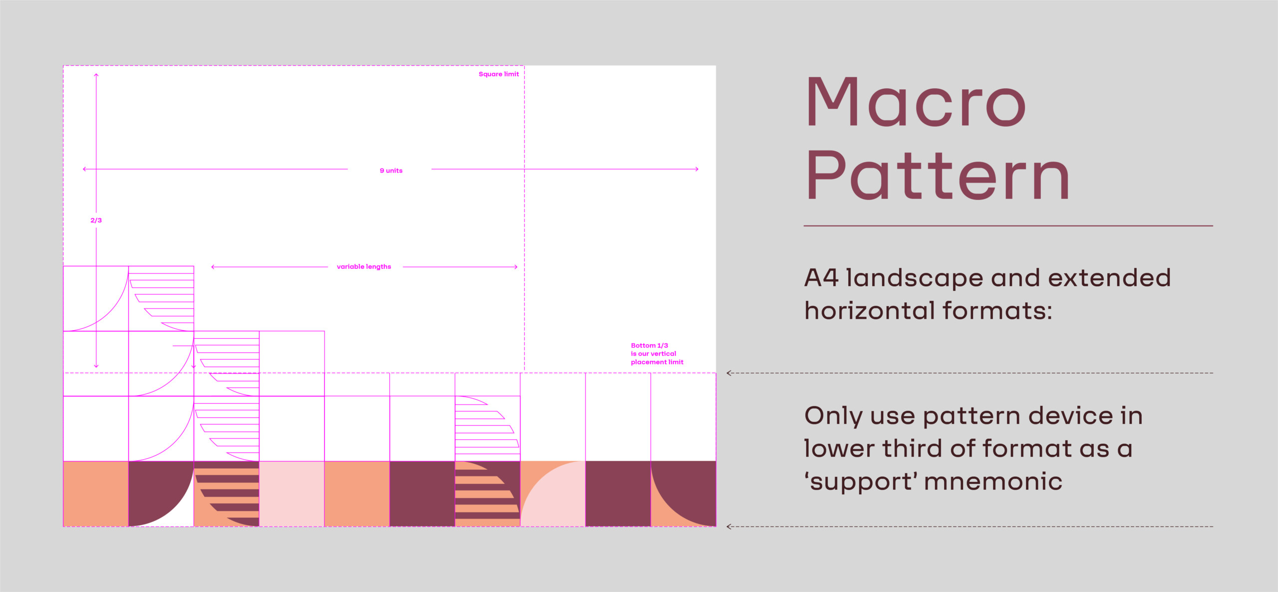
Graphic Language
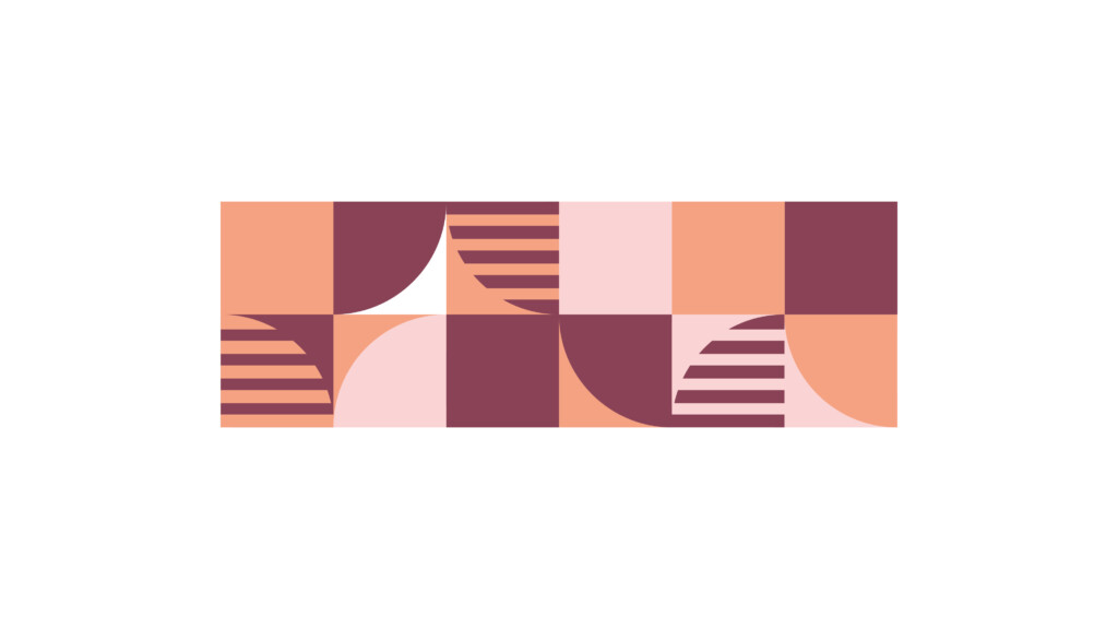
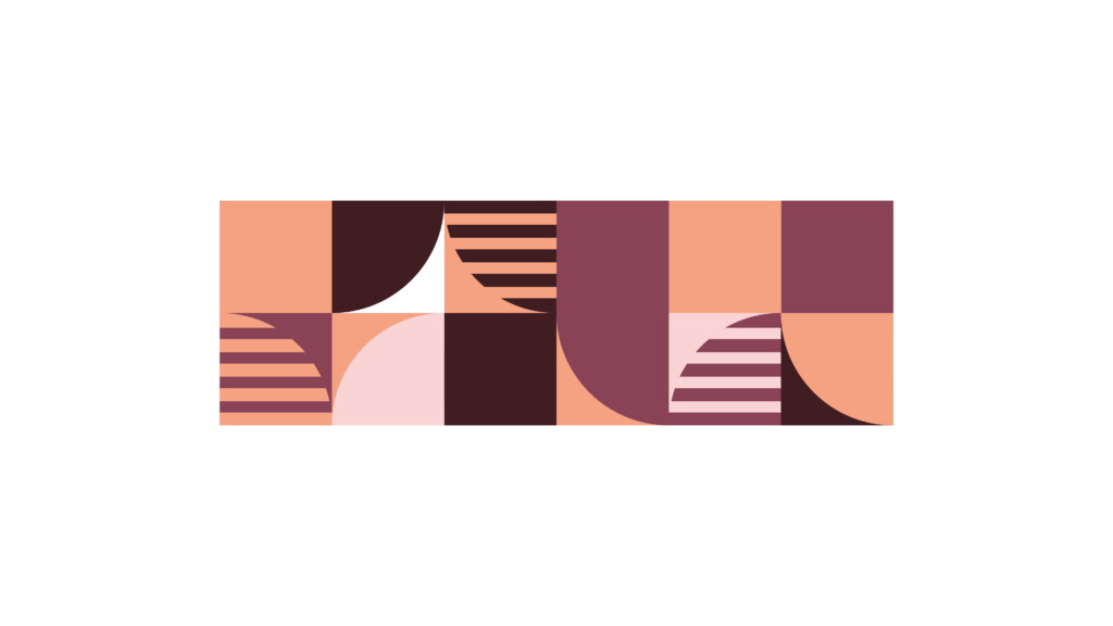
Graphic Texture: Pattern of Light
Our Masarra pattern of light is a sparkling expression of the multi-faceted nature of our promise and the experiences we aim to deliver.
It is an extension of the Masarra Guiding Star logo’s graphic style, evoking our visual branding, and reminding viewers that we are richly textured, dynamic and varied as a Masarra a new organisation.
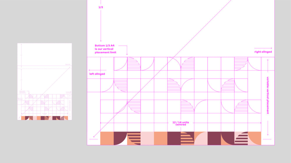
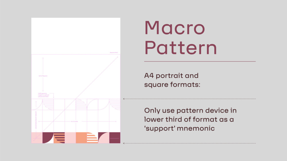
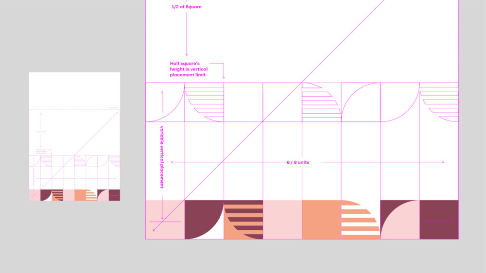
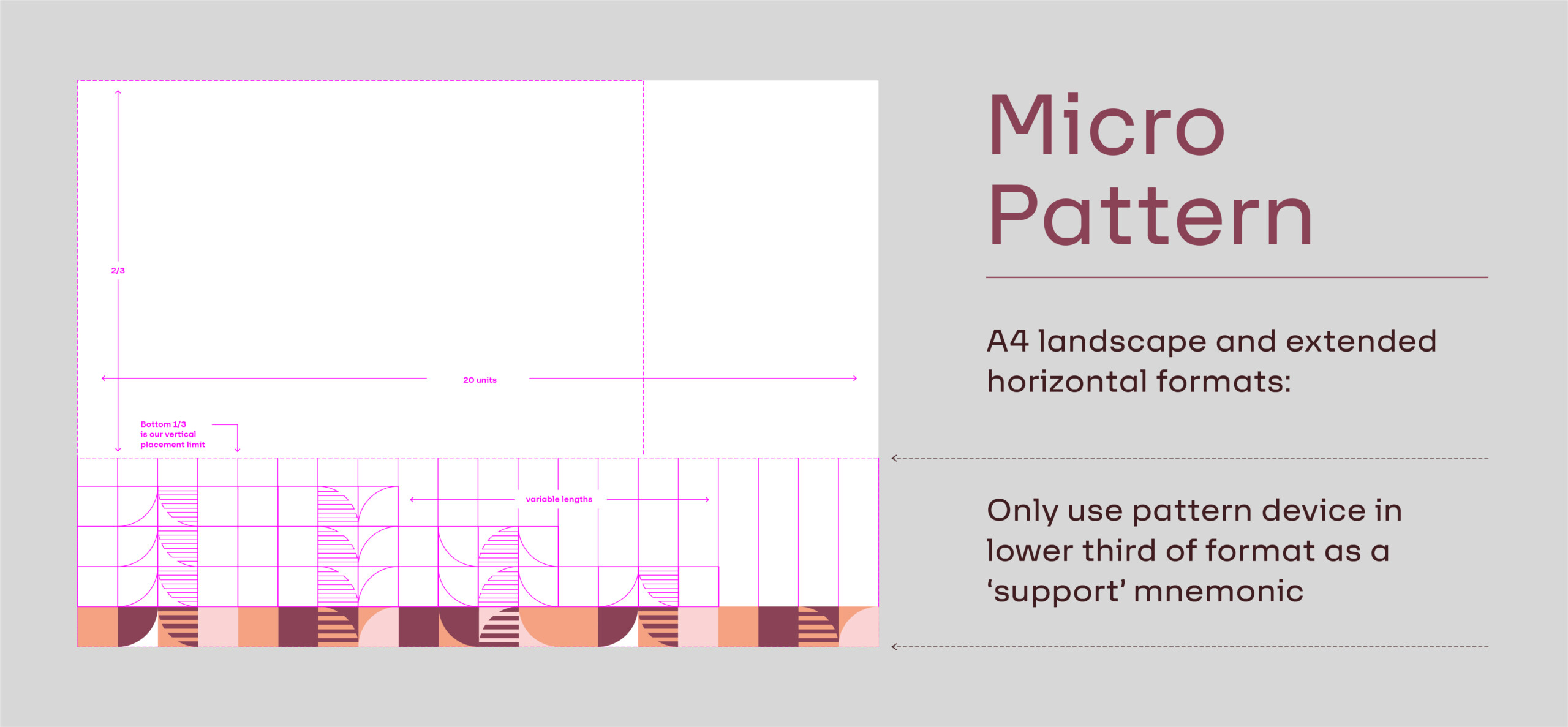
The pattern can manifest in a modular way, always built of a square visual components in a repeatable visual system – from extended length muti-coloured ribbons as longer journeys, to shorthand brand tabs that deliver a smarter and more restrained expression. Each square is a section of colour or pattern that takes inference from our logo.
Below is an overview of how the pattern of light can be implemented across the brand.
The pattern of light exists as three different variants;
1. Strip format
2. Minimal strip format
3. Pattern texture format
(12X12 grid – increasing to a maximum of 20X20 grid)
Please always use only the pattern combinations provided, and be discerning in their deployments. They are intended to be evocative and not overwhelming, and must not be overused as wallpapering or in taking precedence over communication messaging and our primary branding.
As a guiding principle the pattern should not become any more 20% of the overall visual execution across the brand on a global level. This does not mean the brand texture can’t be a dominant component on an individual stand alone component across a range of marketing material.
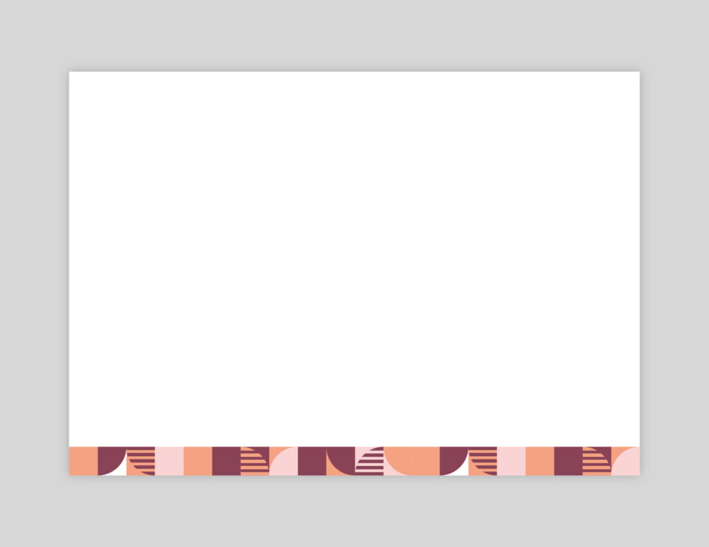
Three Colour Strip Pattern
Four Colour Strip Pattern
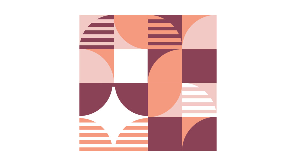
Three Colour Block Pattern
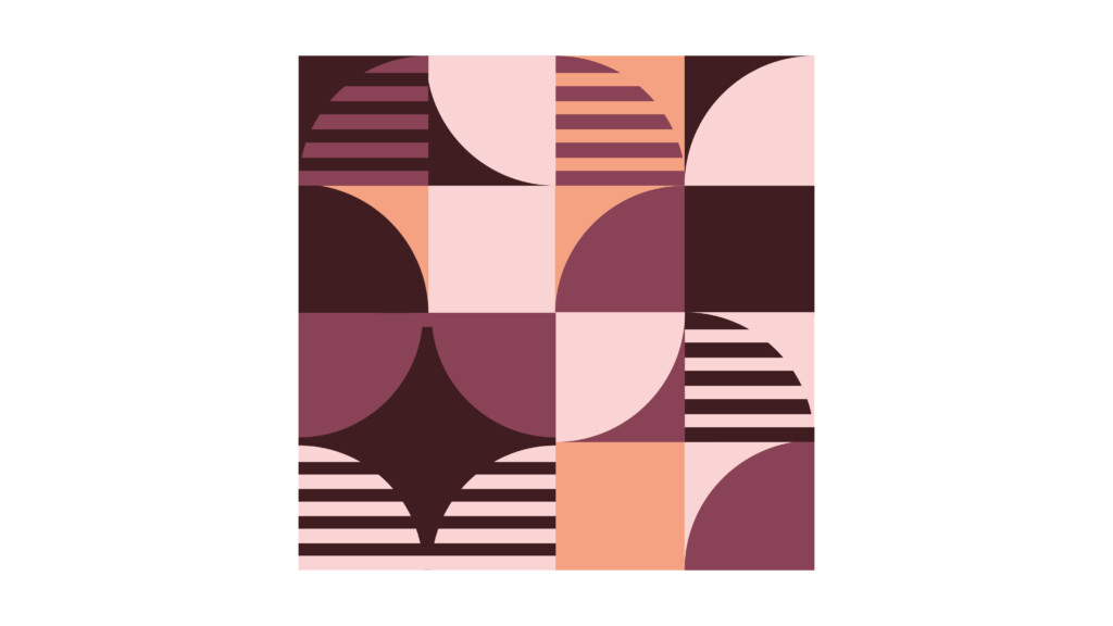
Four Colour Block Pattern -
Pattern Usage Overview
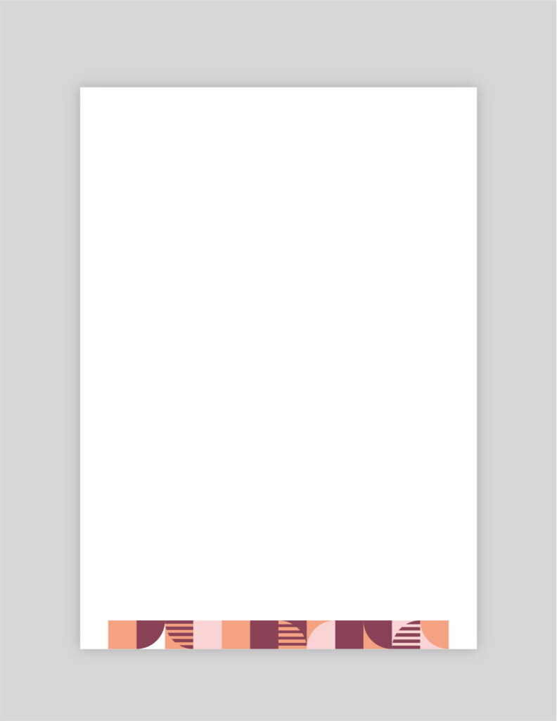
Portrait: Extended
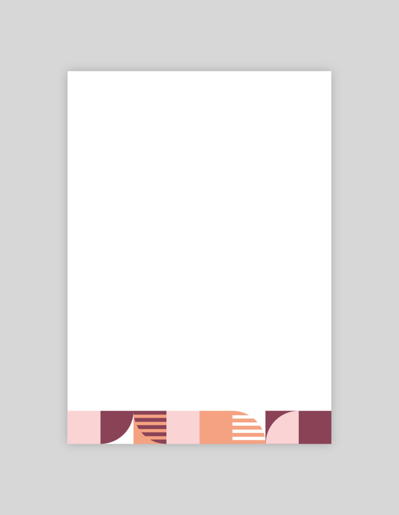
Portrait: Standard
Portrait: Dynamic Brand Tab
Landscape: Extended
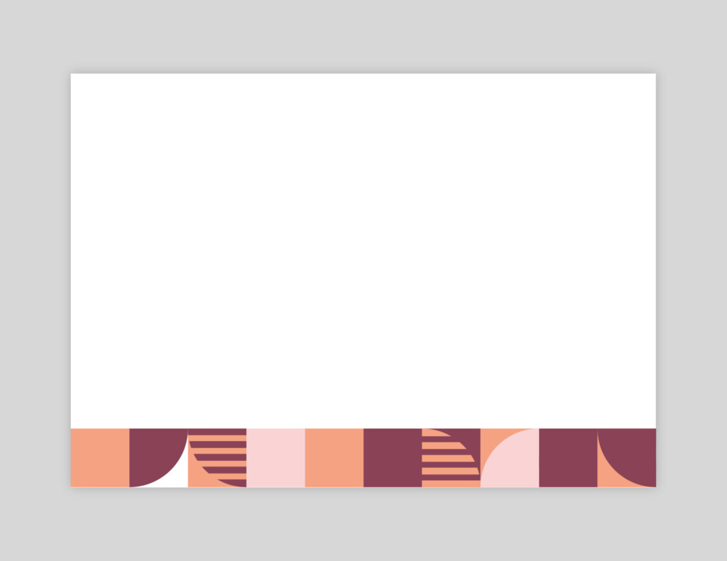
Landscape: Standard
Landscape: Dynamic Brand Tab
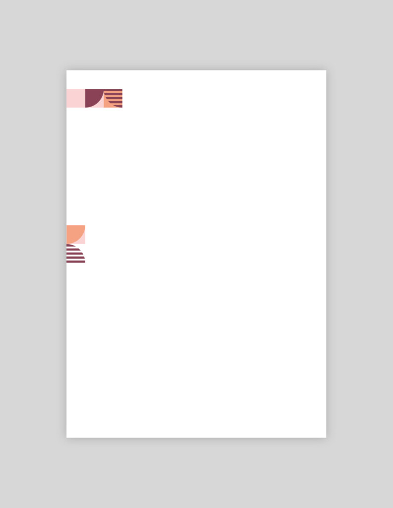
Pattern Usage Guides: Portrait – Micro
Micro Pattern:
Centre Aligned
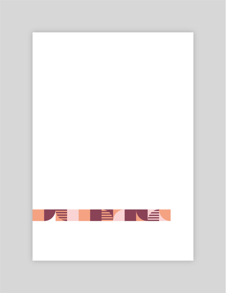
Micro Pattern:
Left Aligned
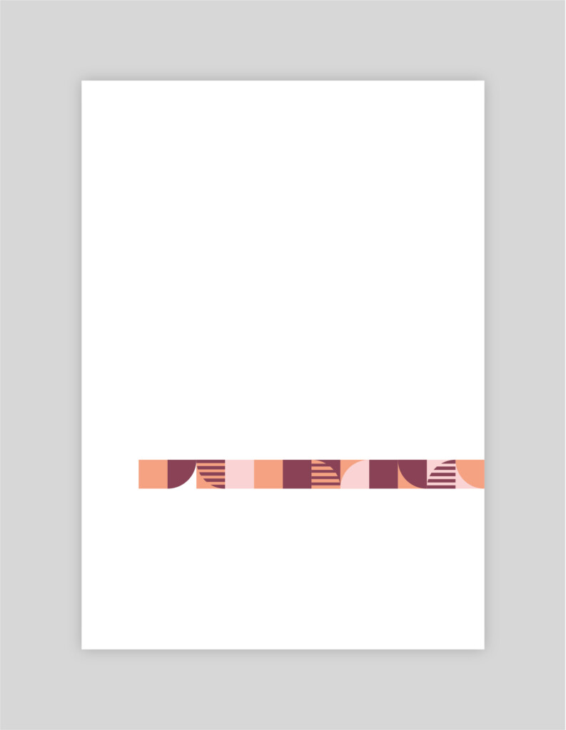
Micro Pattern:
Right Aligned
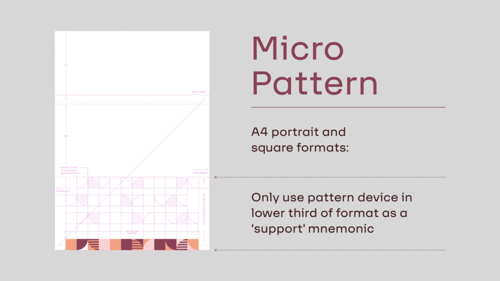
Pattern Usage Guides: Portrait – Macro
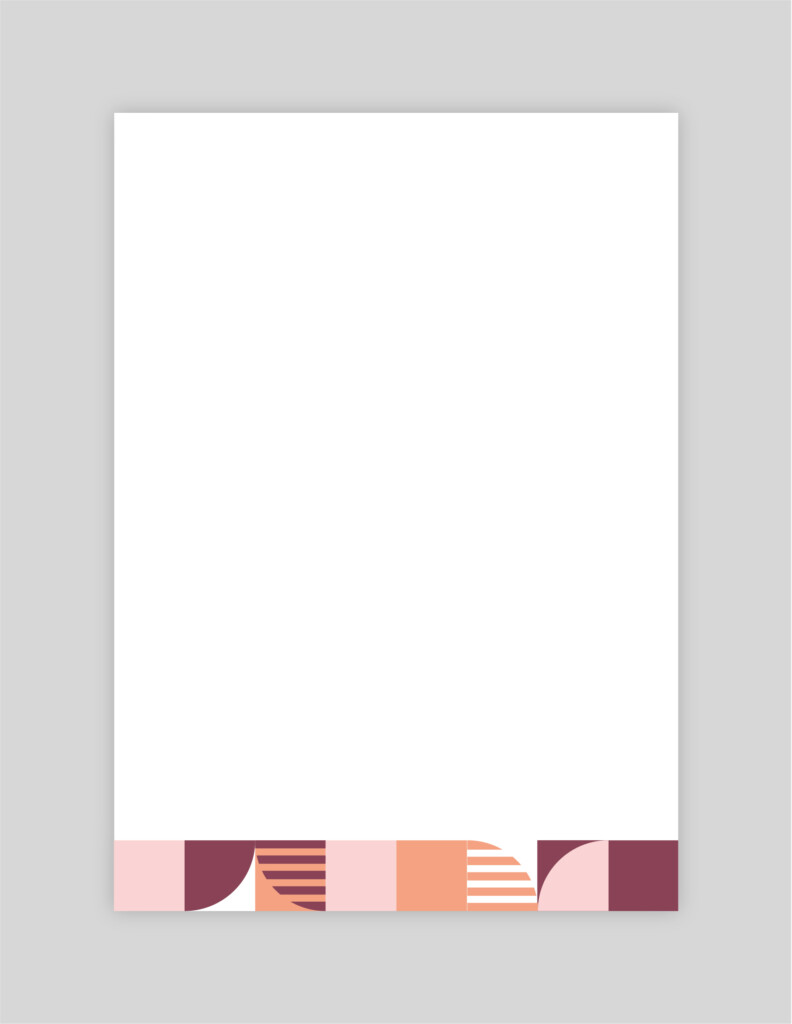
Macro Pattern:
Variable vertical position 01
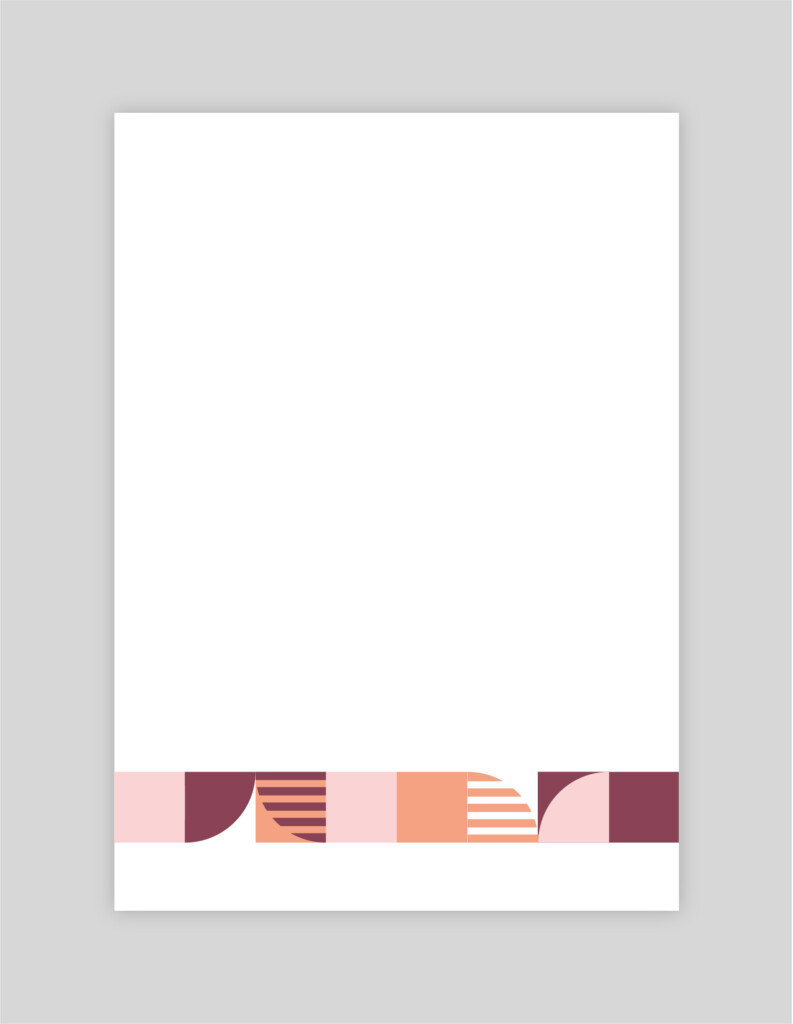
Macro Pattern:
Variable vertical position 02
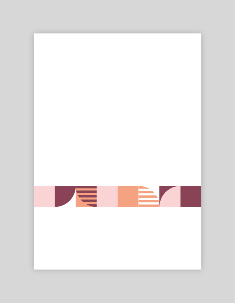
Macro Pattern:
Variable vertical position 03
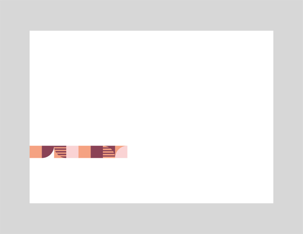
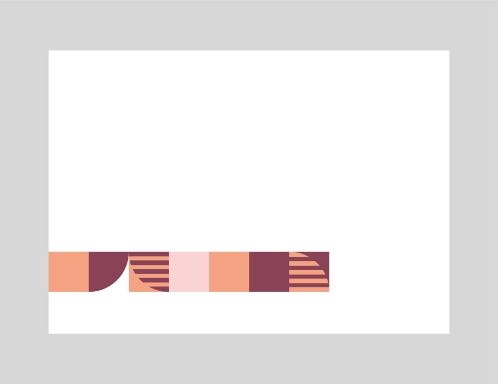
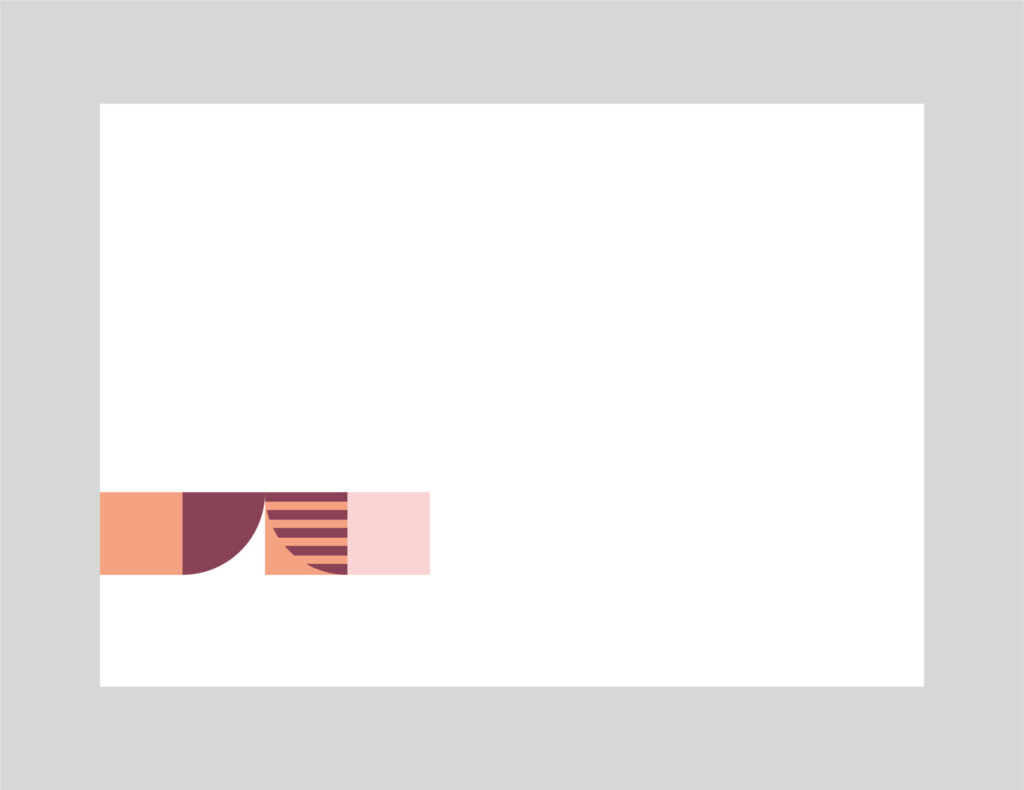
Pattern Usage Guides: Landscape – Micro
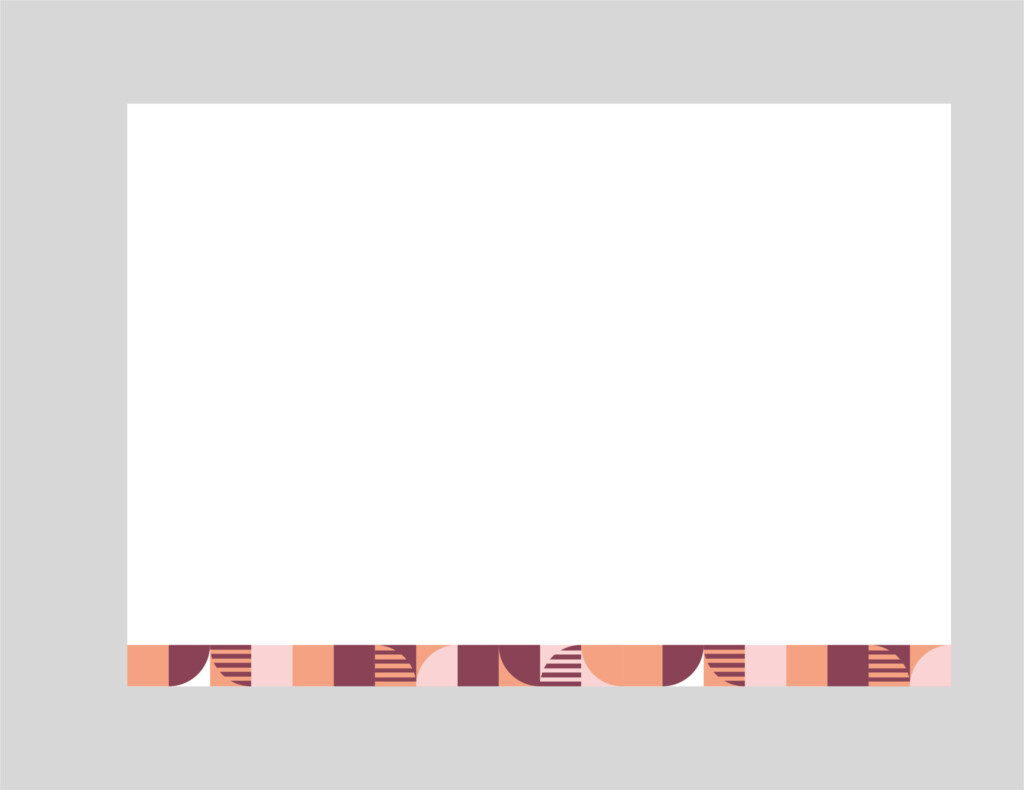
Micro Pattern:
Centred: Full width
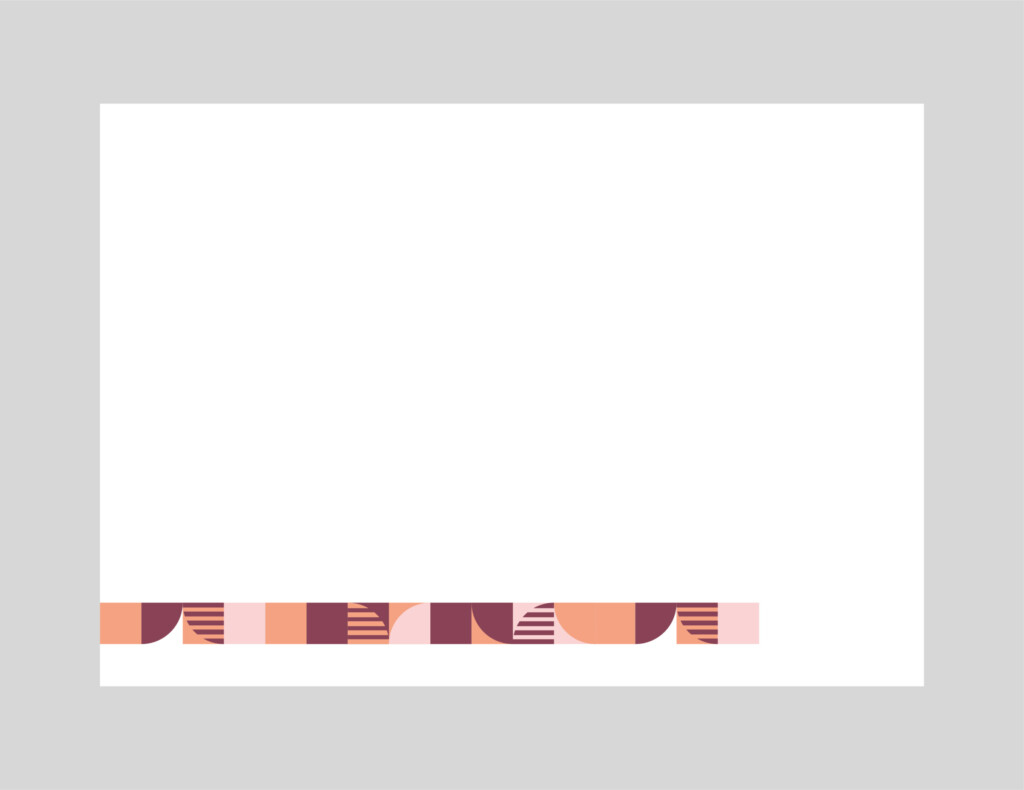
Micro Pattern:
Left Aligned: Long
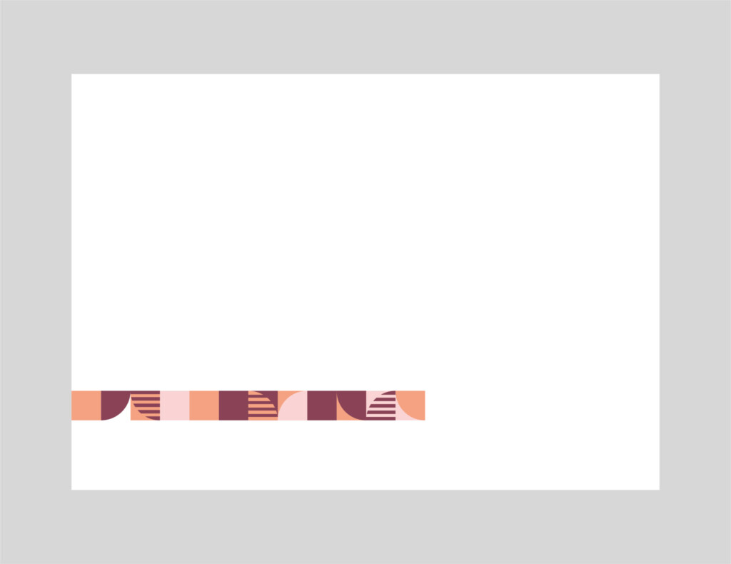
Micro Pattern:
Left Aligned: Medium
Micro Pattern:
Left Aligned: Short
Pattern Usage Guides: Landscape – Macro

Macro Pattern:
Centre Aligned - Full width
Macro Pattern:
Left Aligned: Medium
Macro Pattern:
Left Aligned - Short
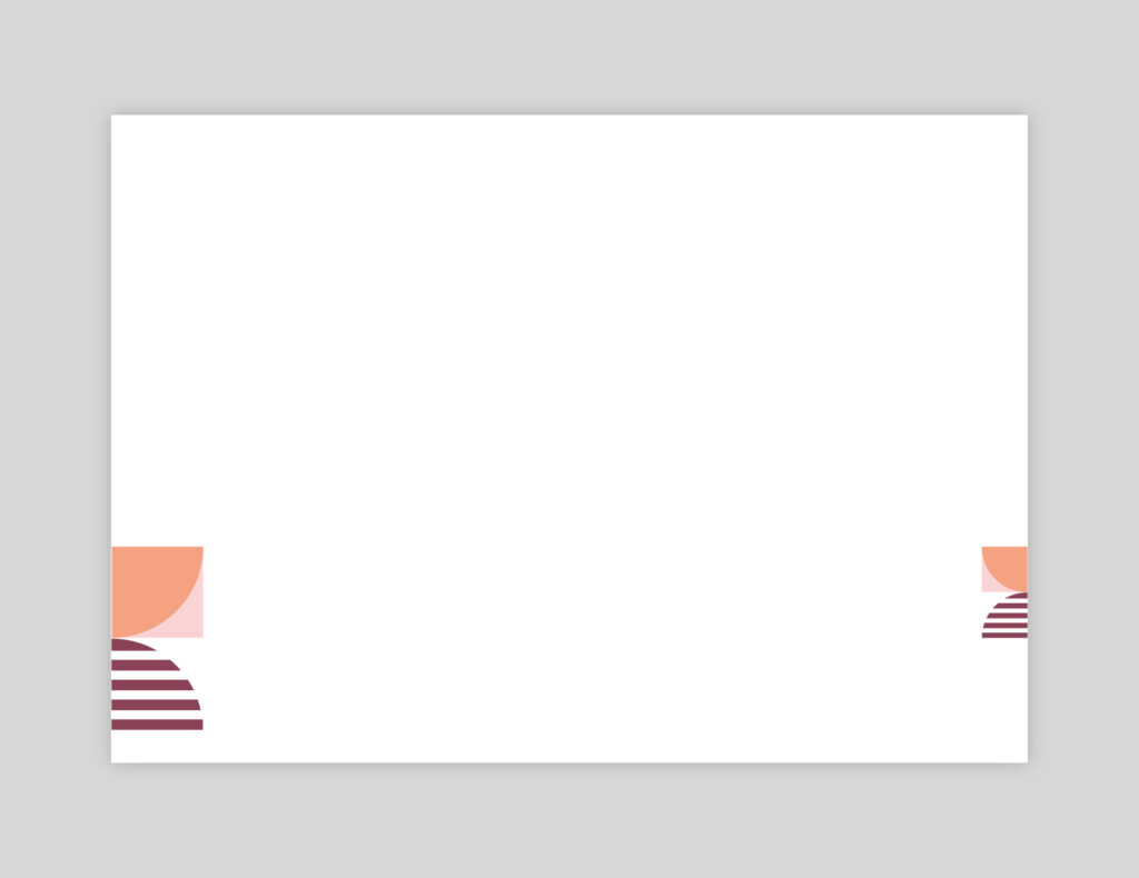
Dynamic Tab Usage Guides: Portrait
Dynamic Tab Usage Guides: Landscape
Graphic Language
Masarra Lens
The following is a breakdown of the Masarra Lens graphic device. The Masarra Lens is a secondary component of the brand visual language and plays an integral role across the brand.
The graphic component can be utilised in a variety of situations and is flexible on how it can be applied.
The Masarra Lens is available in a number of different formats:
- Full circle
- Half Circle
- Quarter Circle
- Quarter Circle (Slatted lines)
These can also be used at 180 degree rotations for the Half Circle, and 90 degree rotations for both the Quarter Circles.
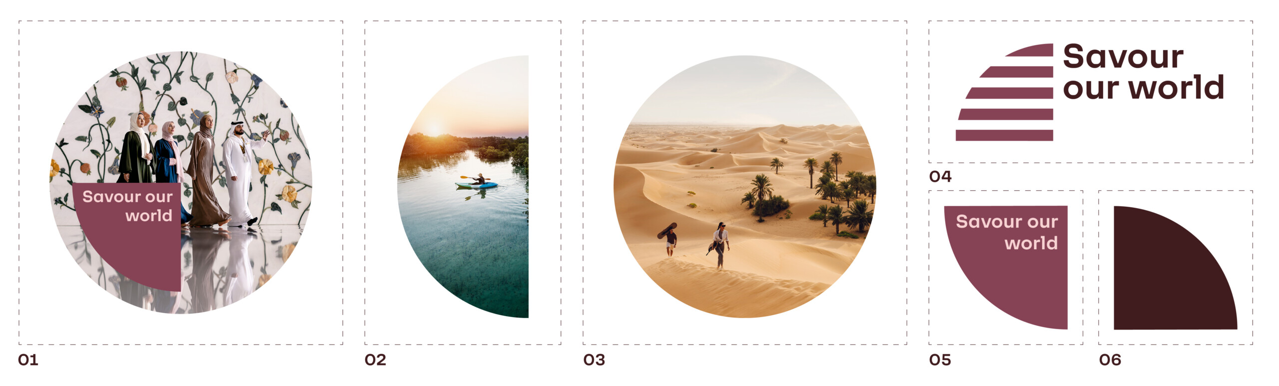
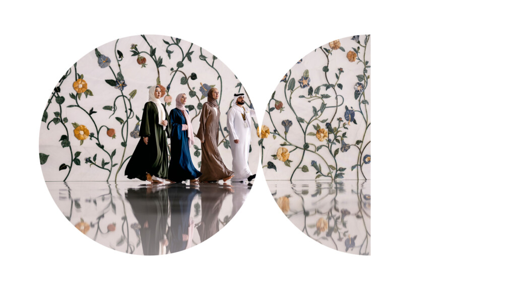
Masarra Lens: Full circle
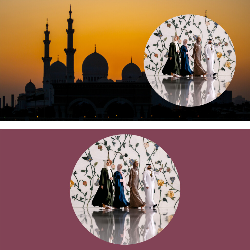
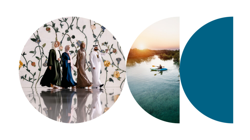
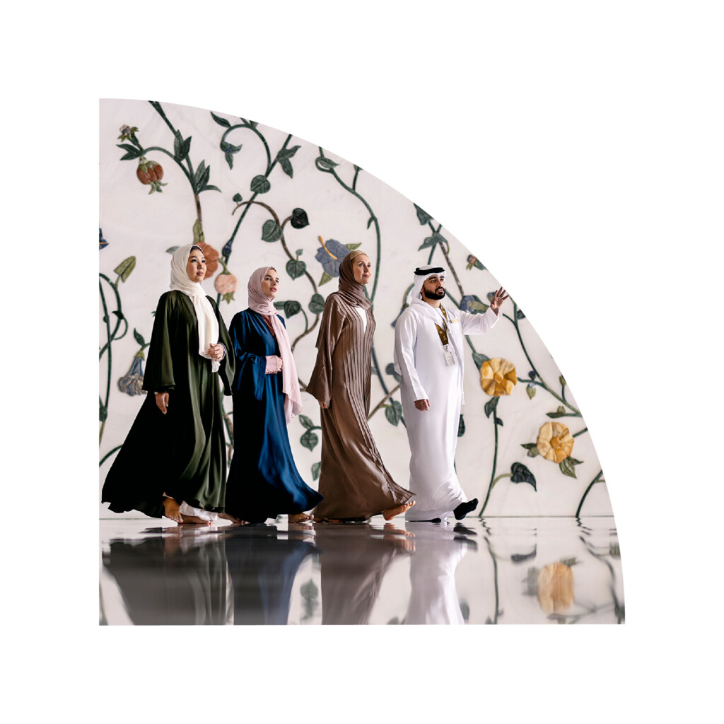
The full circle version of the Masarra Lens can be used as a framing and masking device for imagery and typography as required across all marketing collateral across all print and digital communication.
The full circle version can be utilised across imagery or in combination with the the half circle version only as per the examples shown further down.
Masarra Lens: Full circle
Masarra Lens: Full circle image mask
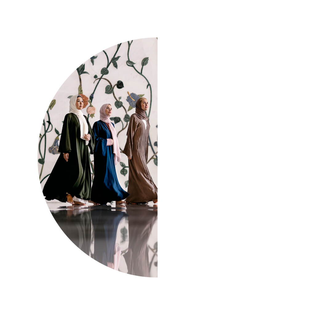
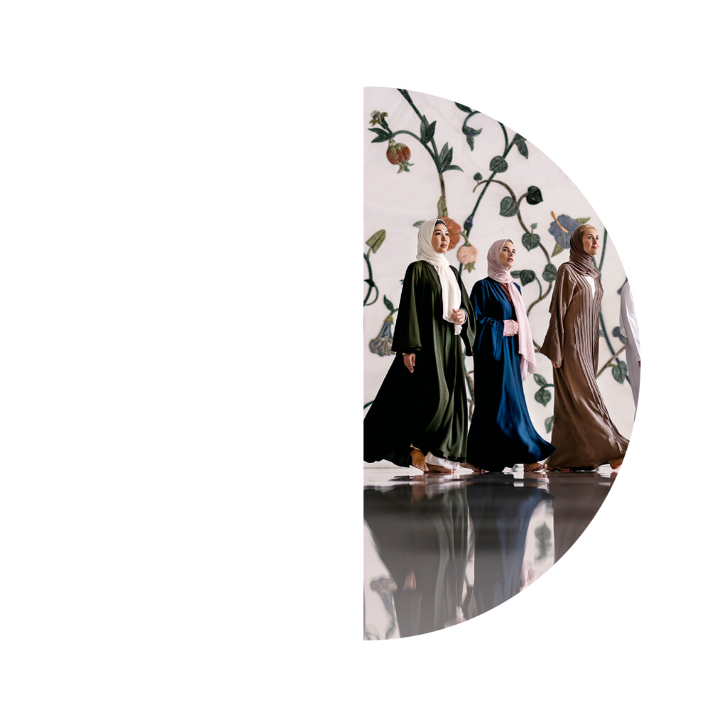
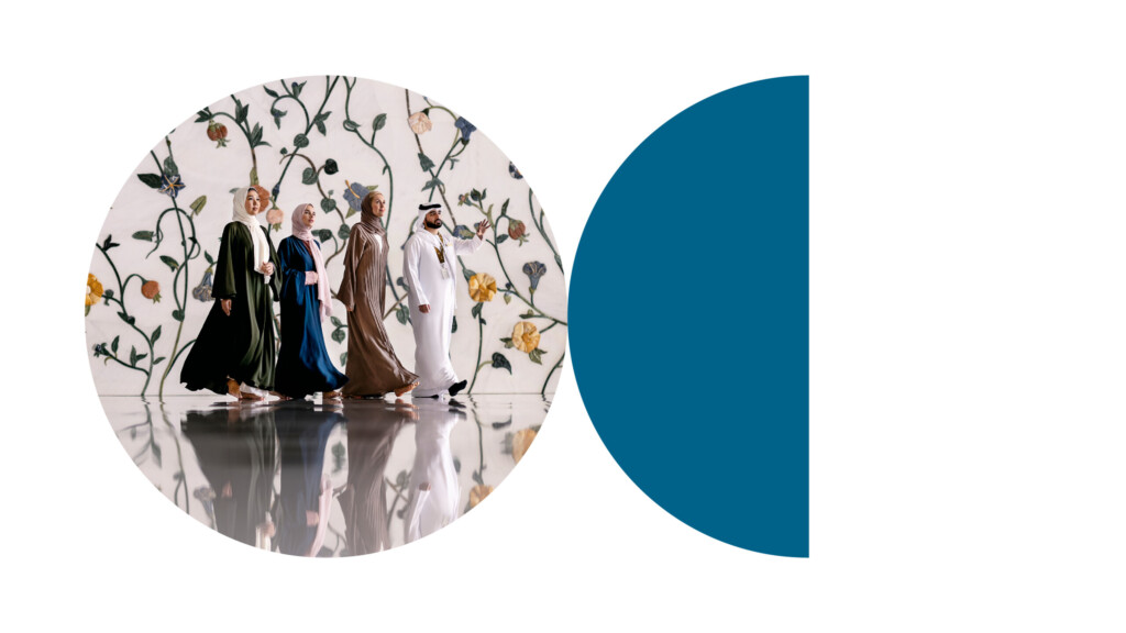
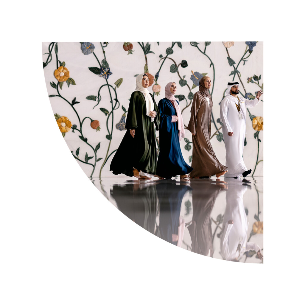
Masarra Lens: Half Circle
The half circle version of the Masarra Lens can be used in the same manner as the full circle version, primarily as a framing and masking device for imagery and typography.
The half circle version can be used independently as an individual component or in combination with the full circle version as per examples shown below.
The half circle can be combined with the full circle to mask the same image, or to mask different images or to hold a fill colour – and can also be used with copy if required.
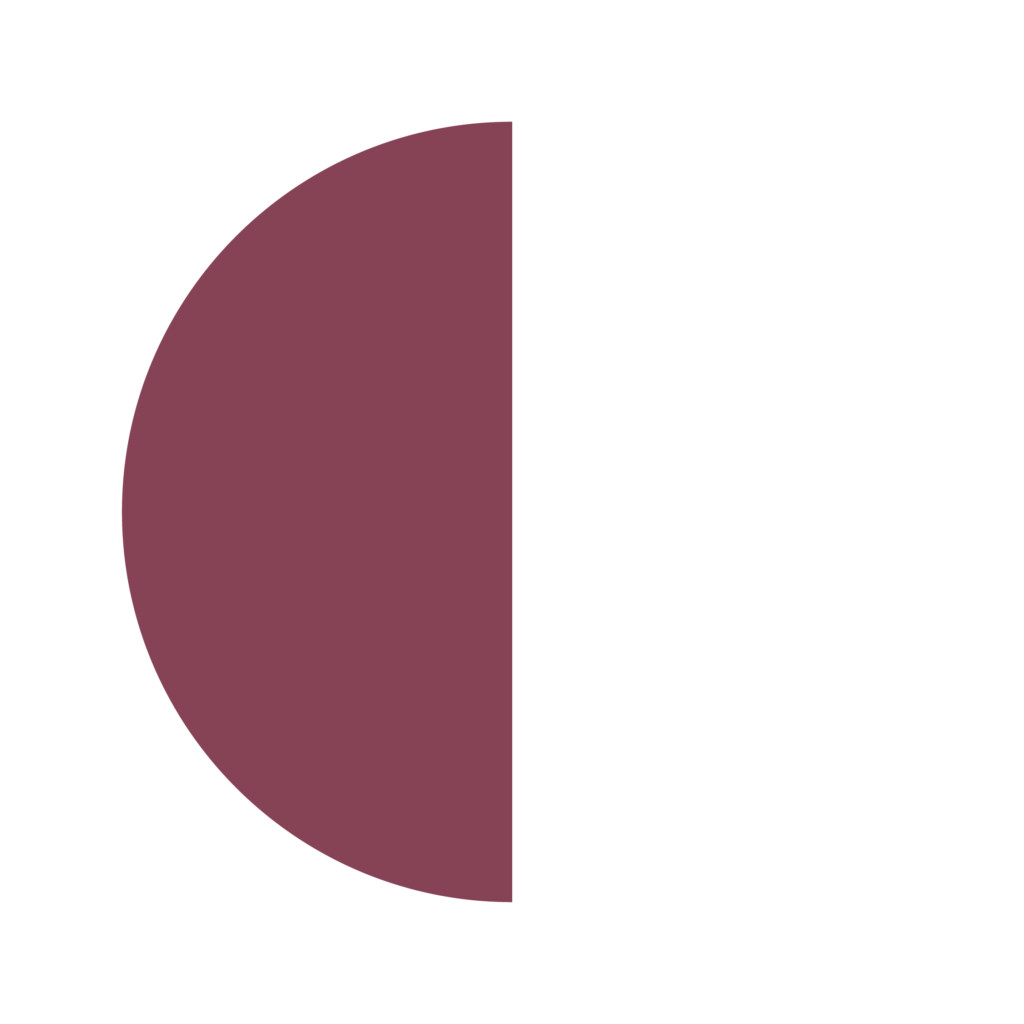
Masarra Lens: Half circle - Left
Masarra Lens: Half circle - Left
Image mask
Masarra Lens: Half circle - Right
Masarra Lens: Half circle - Right
Image mask
Half circle usage examples
Masarra Lens:
Full circle + half circle image mask
Masarra Lens:
Full circle image mask + half circle colour block
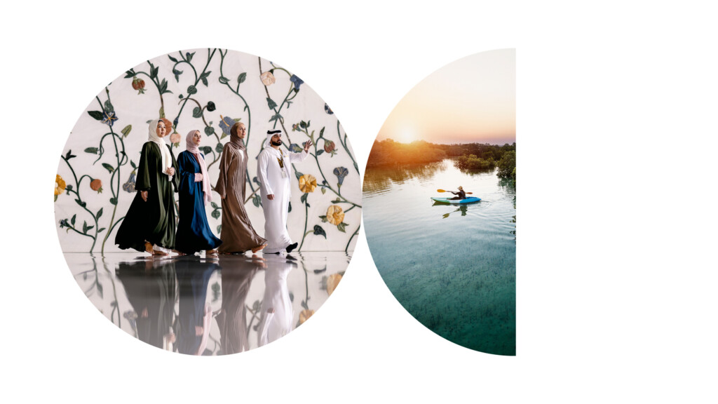
Masarra Lens:
Full circle image mask + half circle image mask
Masarra Lens:
Full circle image mask + half circle image mask + half circle colour block
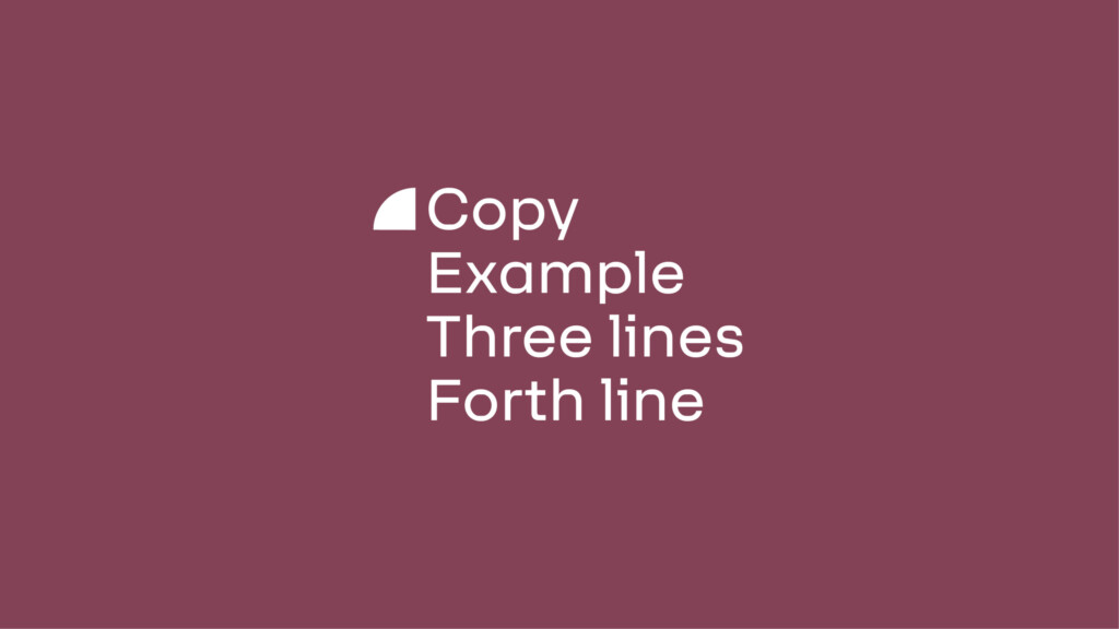
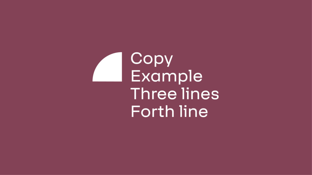
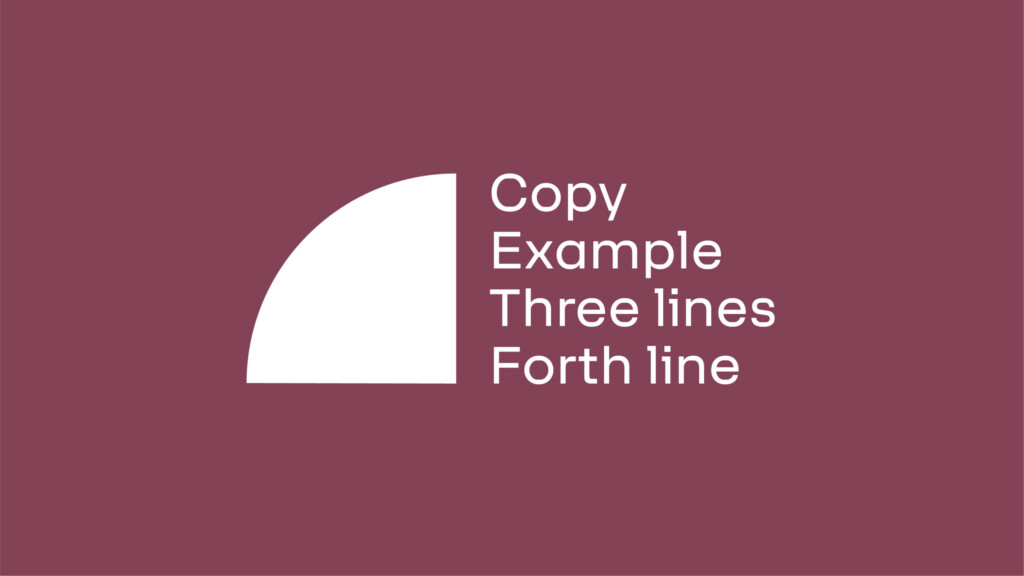
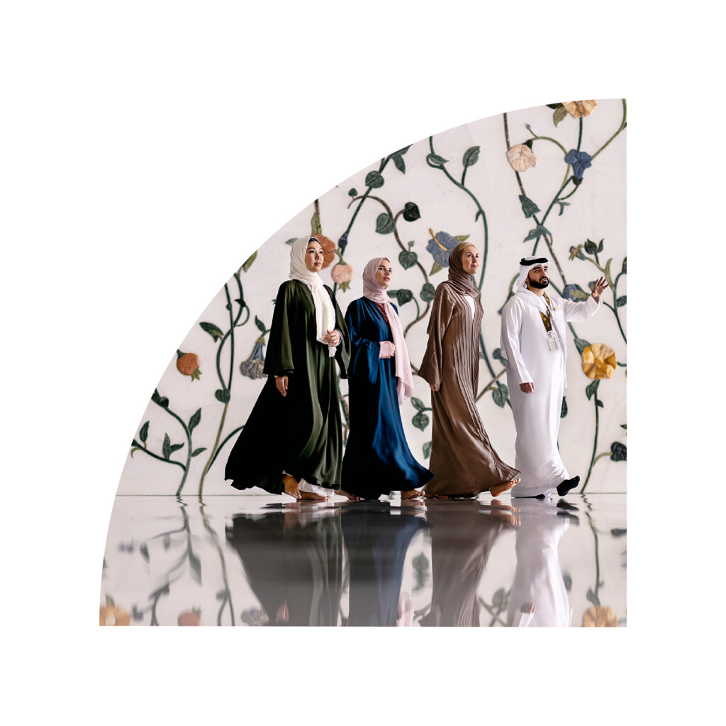
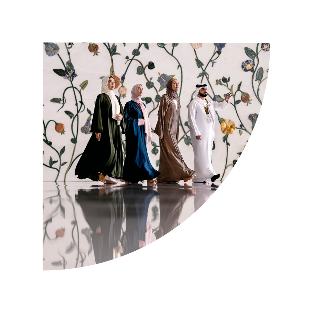
Masarra Lens: Quarter Circle
The quarter circle version of the Masarra Lens has a few distinct differences in how the component functions within the brand language.
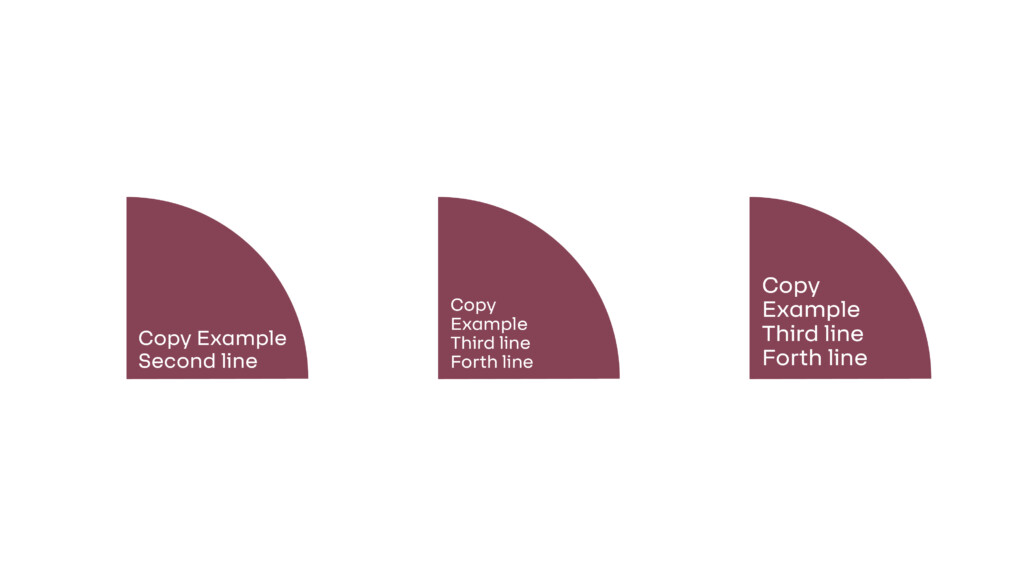
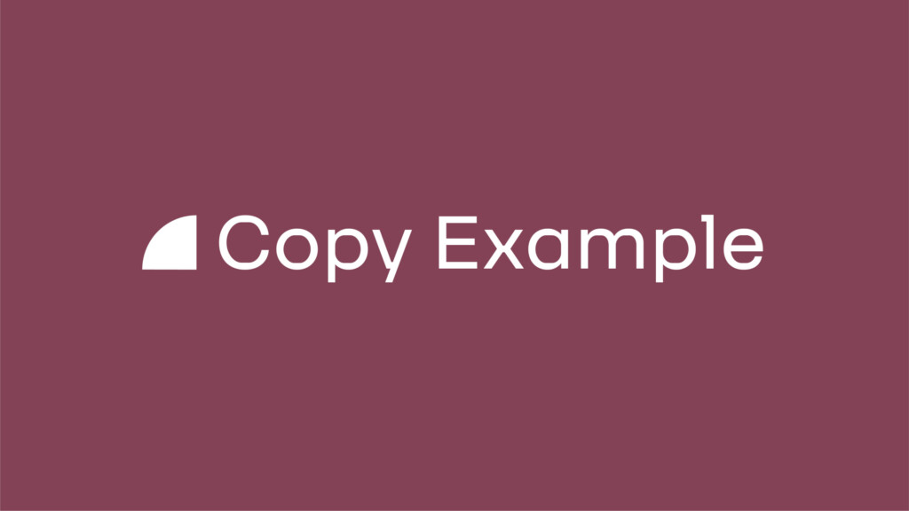
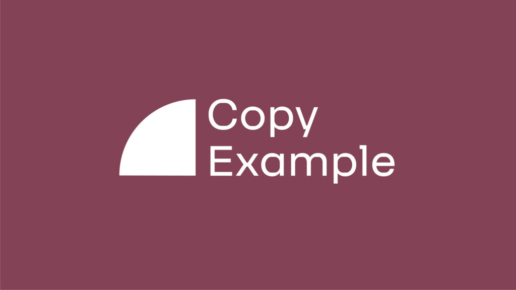
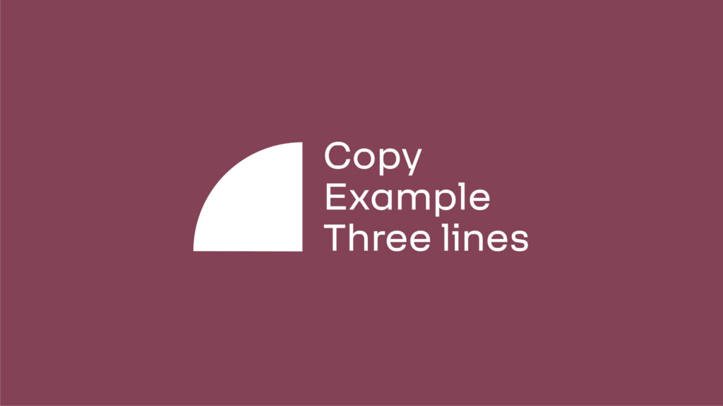
The primary use for the quarter circle version of Masarra Lens should primarily be as a component to highlight copy based information – such as title or heading or an important piece of information.
The quarter circle is available in two distinct versions, with four formats each per version.
The quarter circle can be used at any 90 degree angle to hold information, or as a device to lockup information.
The lens when using as a colour block can adopt any of the brand colours that work cohesively with the overall marketing collateral the quarter circle is featured in.
The quarter circle can additionally be used to frame and mask images – however this should only be implemented in extenuating circumstances such as space restrictive marketing collateral.
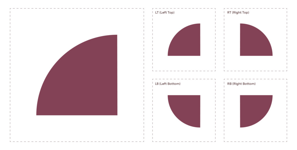
Masarra Lens: Quarter circle - Solid
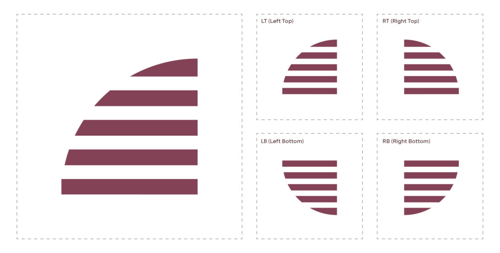
Masarra Lens: Quarter circle - Slatted
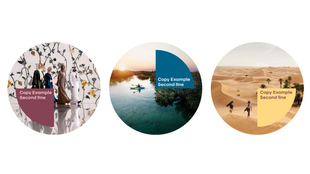
Usage examples
The following are a selection of examples on how to implement the quarter circle version of the Masarra Lens. The quarter circle version can be used both independently in a layout or in combination with the full circle version.
The quarter circle can adopt any of the brand colours are deemed necessary to further complement the overall composition of marketing collateral.
Independent use with copy
Integrated use with full circle Masarra Lens
Masarra Lens: Quarter Circle – Solid
Masarra Lens: Quarter Circle – Slatted
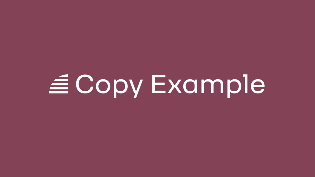
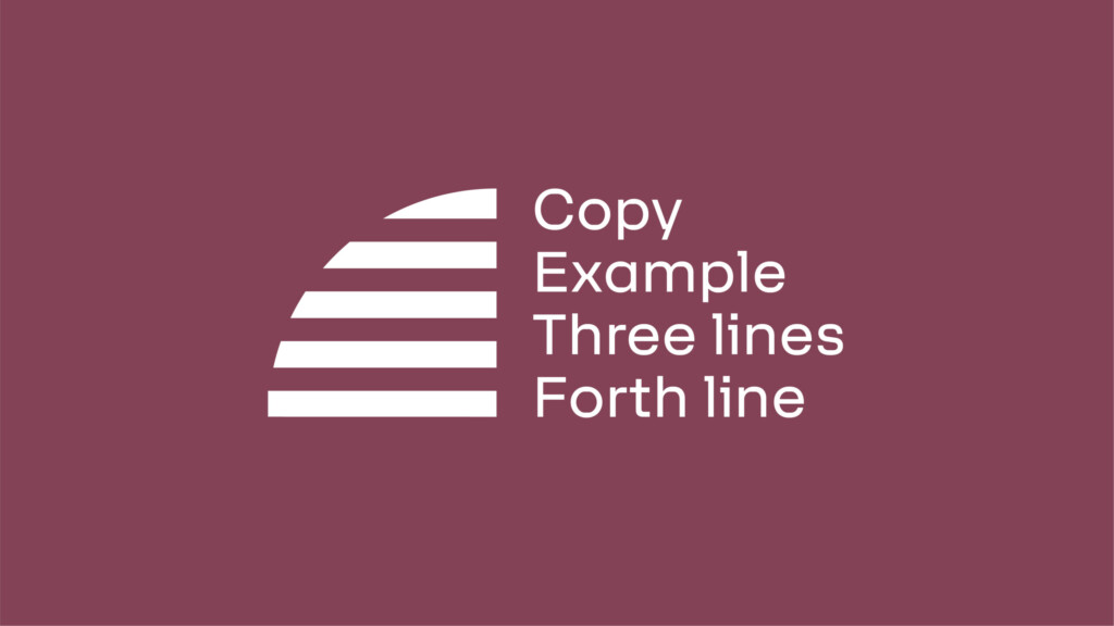
Image mask examples
Implementing image masks for quarter circles only should be in extenuating circumstances in applications where space is restricted.
Quarter Lens - Top Right
Tertiary use: Image mask
Quarter Lens - Bottom Left
Tertiary use: Image mask
Quarter Lens - Top Left
Tertiary use: Image mask
Quarter Lens - Bottom Right
Tertiary use: Image mask